



Dung Tran
Visual Designer
Table of Contents:
Project Overview
Making a product easier to understand before asking customers to buy it
TrinkTiger is a German pet hydration brand focused on premium hydration products for cats.
A cat fountain is easy to recognise. Deciding that your cat needs one, understanding why one model costs more than another, and feeling confident enough to choose it are different questions.
Those questions shaped the Shopify project.
UXphoria worked across CRO strategy, UX/UI design and Shopify development, including homepage restructuring, product page optimization, mobile UX, trust architecture and the structure of educational content.
The goal was not simply to put more information on the store. Each part of the experience needed to help customers understand why hydration matters, what makes TrinkTiger different and what they should know before choosing a product.
Project: TrinkTiger Pet Fountain Website Redesign, Improving Trust, Education, and Purchase Confidence
Platform: Shopify
Industry: Pet wellness / e-commerce
Scope: CRO strategy, UX/UI design, Shopify development, homepage restructuring, product page optimization, mobile UX, trust architecture and educational content structure
The Client
TrinkTiger operates in a category where products can appear deceptively simple.
The fountains have concrete features: stainless-steel construction, filtration, quiet operation, different capacities and wireless options. But those specifications only become useful once customers understand why the category matters and what those differences mean in everyday use.
TrinkTiger was also positioned above low-cost alternatives.
That made product understanding, premium-value explanation and trust especially important to the buying experience.
The Challenge
Pet hydration is not an obvious urgency purchase.
Before comparing fountains, customers need enough context to understand the problem, the product and the reasons behind a premium choice.
1. The Product Solved a Problem Customers First Needed to Understand
The purchase decision started before product comparison.
Customers needed enough context around hydration to understand why a fountain could matter in the first place.
Without that foundation, specifications such as filtration, capacity or wireless operation had much less meaning.
What the experience needed to answer
Why does hydration deserve attention?
Why choose a fountain?
What role does the product play in everyday care?
When should customers start comparing models?
2. Premium Pricing Needed Clear Reasons
TrinkTiger was not competing as the cheapest option in the category.
The experience therefore needed to support a premium buying decision without reducing the product to a long specification list.
Customers needed to understand why stainless steel, wireless placement, filtration, cleaning, noise level and durability could matter in daily use.
What the experience needed to answer
Why does stainless steel matter?
Why does wireless operation matter?
What makes the product different from lower-cost alternatives?
What makes the premium positioning reasonable?
3. Trust Needed to Support the Decision, Not Sit Apart From It
Hydration and pet wellbeing are part of TrinkTiger's domain expertise.
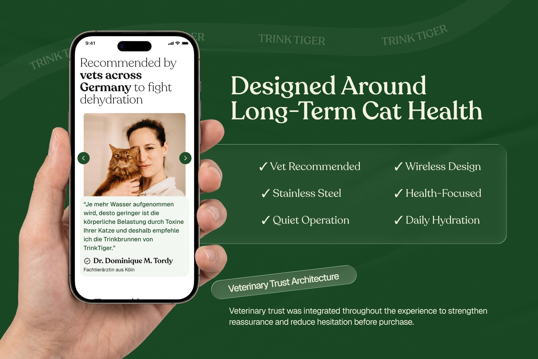
For a product connected to an animal's everyday wellbeing, reassurance carries more weight when it appears close to the claim or decision it supports.
Veterinary context, educational explanations, customer evidence and practical reassurance therefore needed clear roles within the buying journey.
4. Mobile Needed Tighter Prioritisation
Mobile did not need a different sales argument. It needed tighter prioritisation.
There is less room for parallel information, and long explanatory sections can quickly separate the customer from the product or the next action.
Product information needed to be quick to scan. Important reassurance needed to remain accessible. Purchase actions needed clear priority.
5. Product Education Needed to Work Inside the Shopping Journey
Education could not function as a separate layer customers were expected to connect to the product themselves.
Hydration information, product details, FAQs, practical guidance and reassurance needed to support the same decision.
The challenge was to give customers enough understanding without turning the store into an instruction manual.
The Solution
Education could not function as a separate layer customers were expected to connect to the product themselves.
Hydration information, product details, FAQs, practical guidance and reassurance needed to support the same decision.
The challenge was to give customers enough understanding without turning the store into an instruction manual.
The Process
Phase 1: Product Relevance Before Product Comparison
The buying decision started with the reason to care.
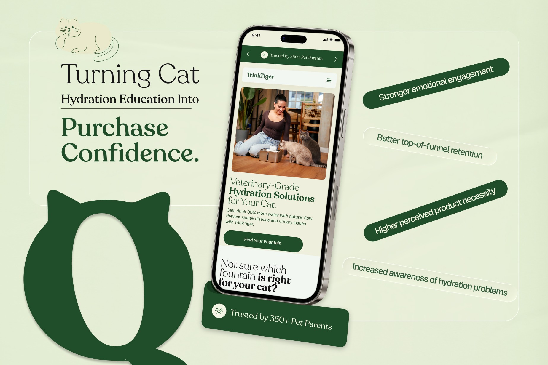
We structured the experience so customers could understand the role of hydration before moving deeper into product differences, practical advantages and purchase details.
That gave the homepage a broader job than simply presenting products. It needed to establish enough context for the product range to make sense.
What changed
Hydration context moved closer to the shopping journey
Product relevance came before deeper comparison
Educational content supported commercial sections
The homepage established context for the product range

Phase 2: Premium Value Through Everyday Relevance
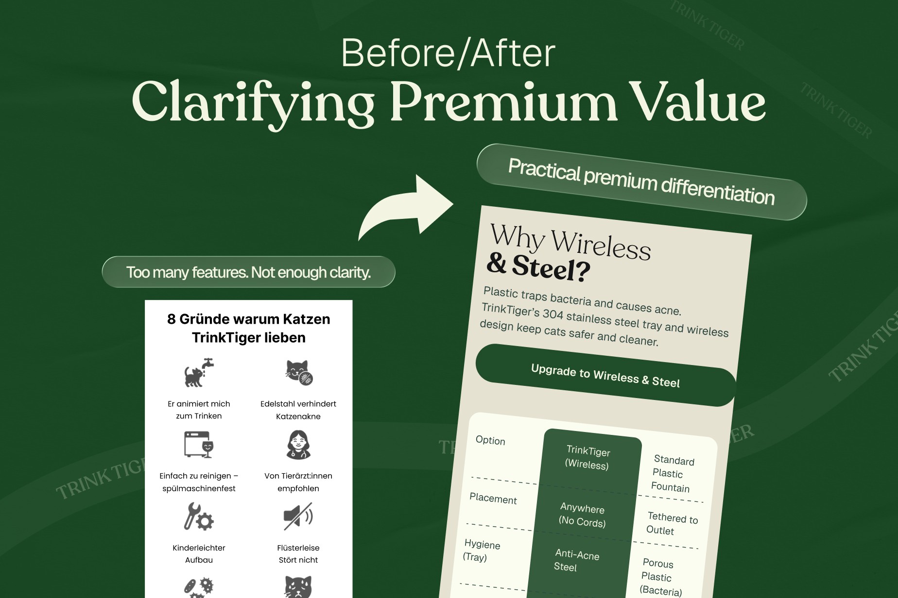
Features such as stainless steel, wireless placement, filtration, cleaning, noise level and capacity were treated as parts of everyday product use.
A material choice can matter because of hygiene and durability.
Wireless operation can matter because customers have more freedom over where the fountain sits.
Cleaning and filtration matter because the fountain becomes part of a daily routine, not just a one-time purchase.
The specifications still needed to be there. The important part was connecting them to something the customer could evaluate.
The point was not to hide the specifications. It was to give them meaning.
What changed
Technical features were connected to practical use
Premium materials received clearer context
Product differentiation became easier to evaluate
Price and value could be considered together
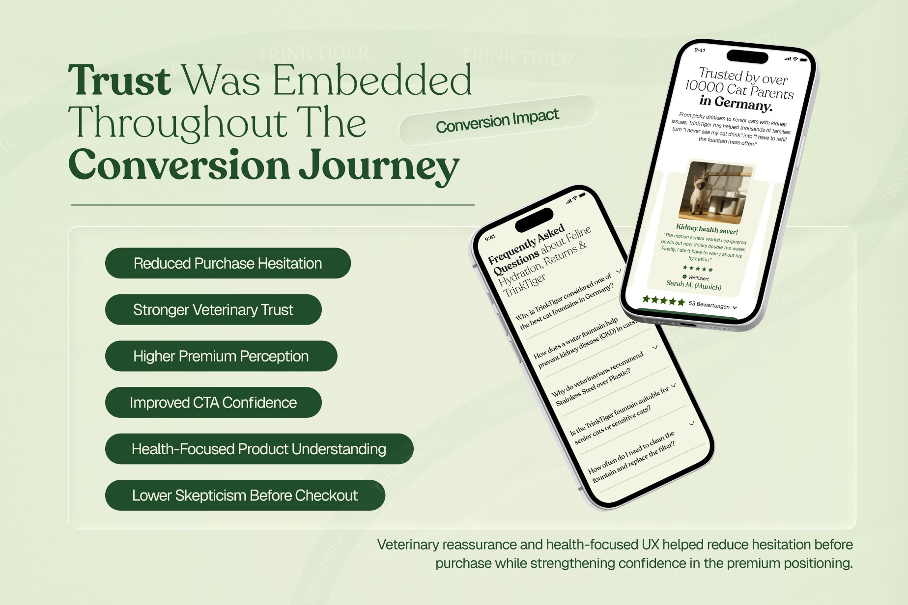
Phase 3: Product Education and Trust in the Same Journey
Hydration and pet wellbeing are part of TrinkTiger's domain expertise.
UXphoria's role was to structure that information so it could support the ecommerce experience.
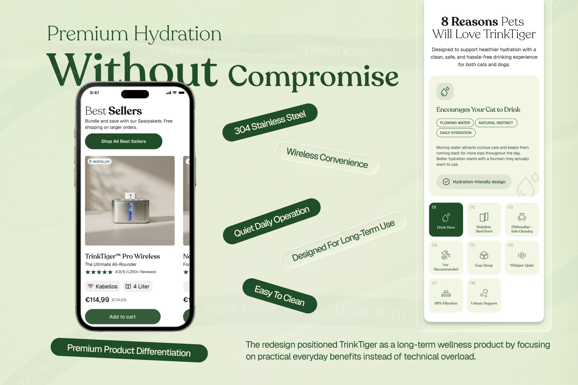
Educational explanations, product information, FAQs and reassurance were brought into the decision flow rather than treated as separate layers that customers would need to connect themselves.
Trust followed the same principle.
What changed
Educational content became part of product evaluation
Veterinary context supported relevant decision points
FAQs and reassurance sat closer to purchase questions
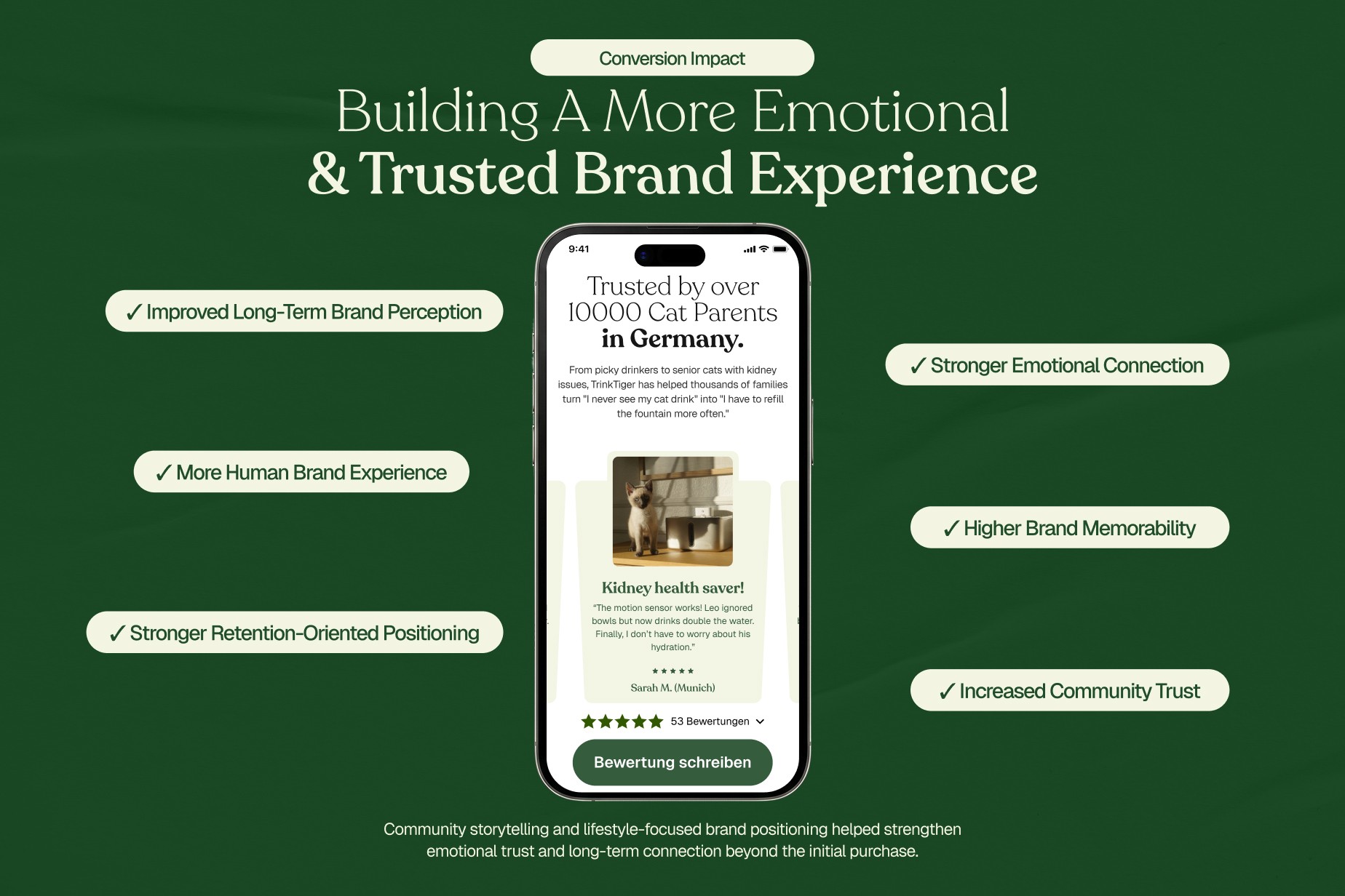
Trust was distributed through the experience rather than isolated in one section
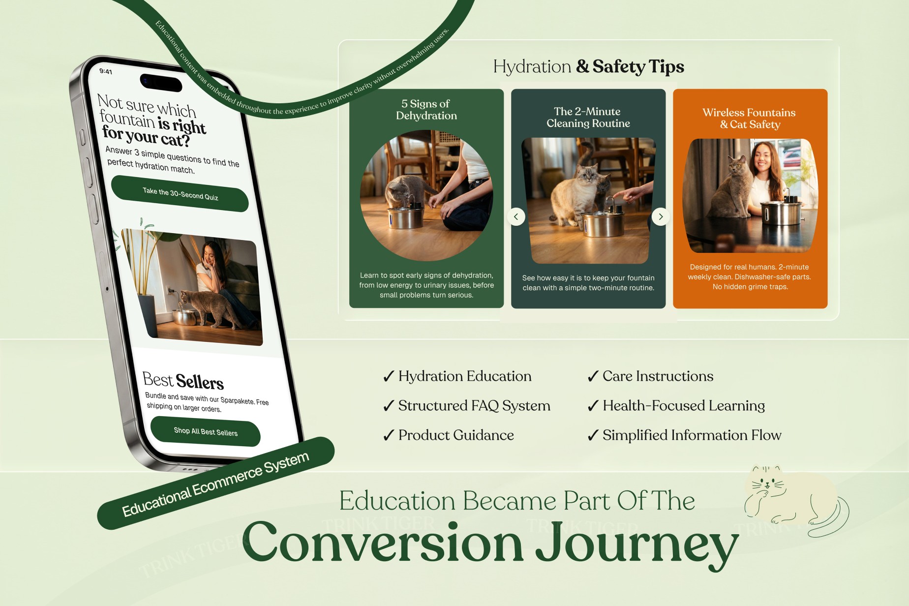
Phase 4: Educational Ecommerce System
The product page had to do more than display the fountain.
It needed to bring together product recognition, practical value, evidence, product fit, reassurance and purchase action without making the page feel like an instruction manual.
That affected how product advantages were grouped, how educational material entered the page, where proof appeared and how purchase information was prioritised.
Customers could move from understanding the product to evaluating it without repeatedly leaving the buying context.
What changed
Product advantages were grouped around meaningful decisions
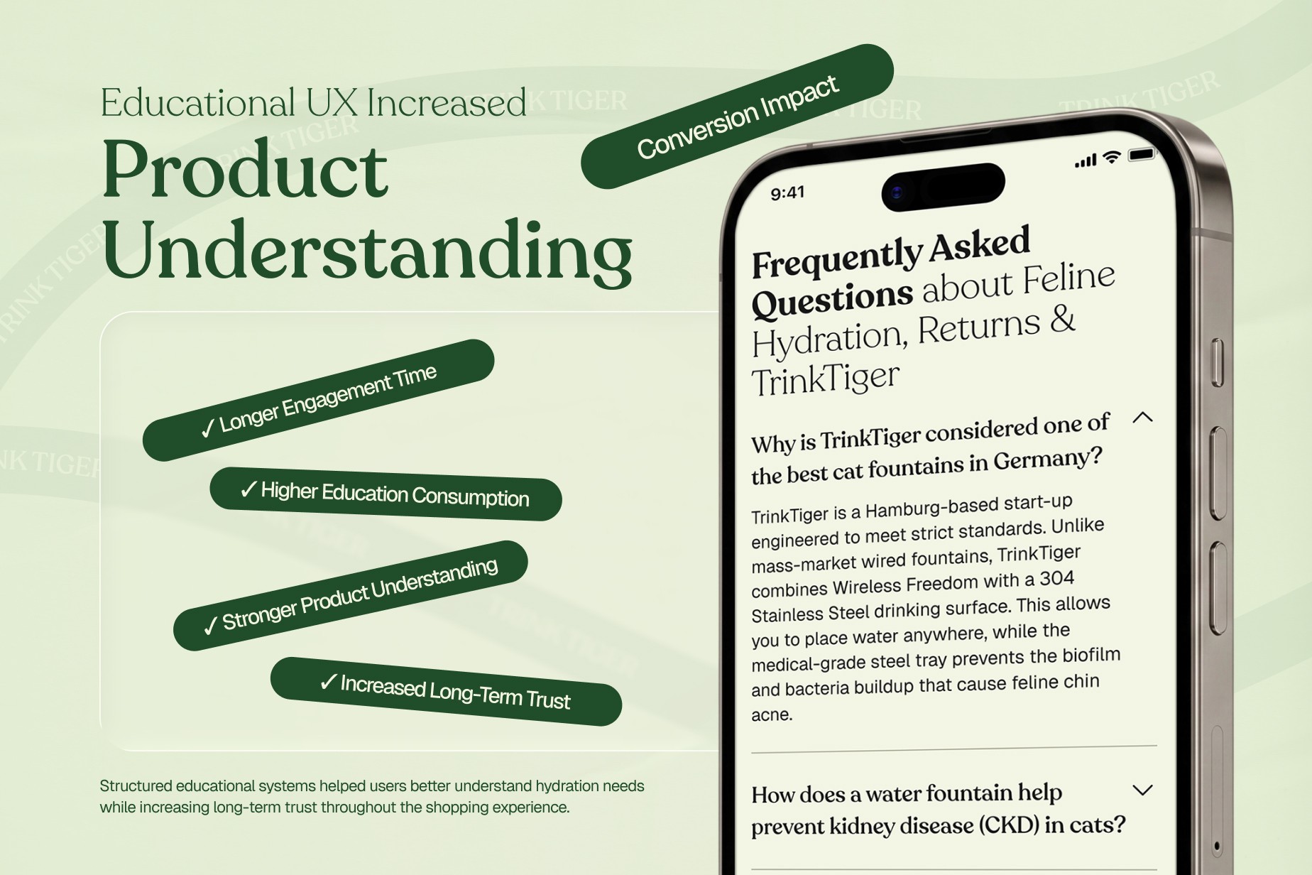
Education and product detail worked together
Evidence appeared closer to relevant claims
Purchase information received clearer priority
Related service: Product Page Optimization
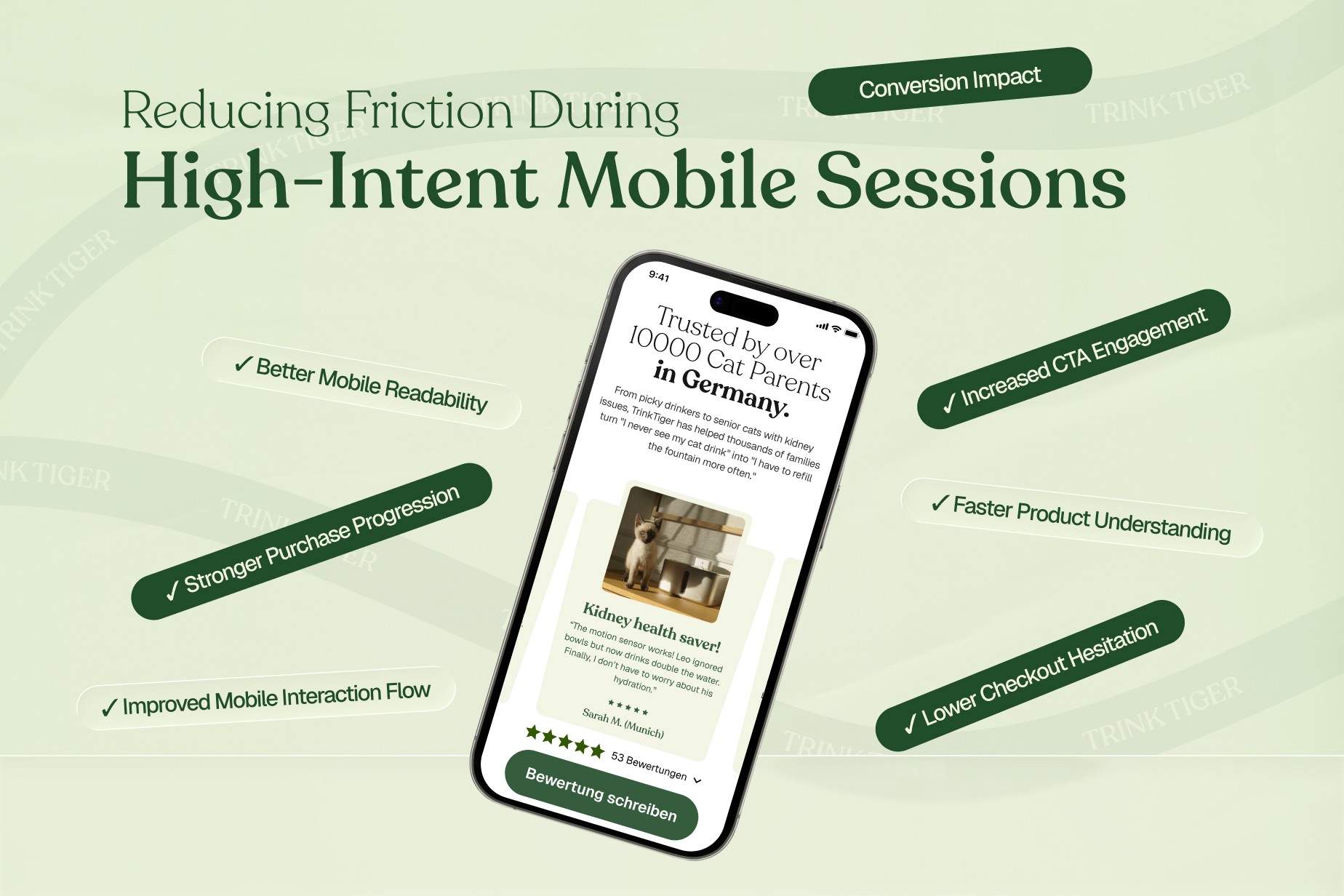
Phase 5: Mobile CRO & Purchase Prioritisation
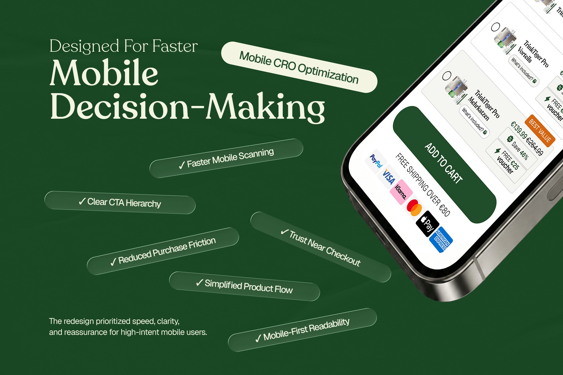
Mobile did not need a different sales argument. It needed tighter prioritisation.
Our mobile Shopify CRO work focused on making the same decision structure usable on a smaller screen.
Product information needed to be quick to scan. Important reassurance needed to remain accessible. Purchase actions required clear priority, while longer explanations had to justify the space they occupied.
The mobile layouts were designed around the order in which customers needed information, rather than compressing the desktop experience into a narrow viewport.
What changed
Faster scanning of product information
Clearer purchase-action hierarchy
Reassurance remained accessible
Long-form content was prioritised around mobile constraints
Responsive pacing followed the buying decision
Related service: Mobile Shopify CRO
Phase 6: Carrying the CRO Decisions Into Shopify Development
UXphoria's role continued through Shopify development.
That connection mattered because many of the important CRO decisions depended on implementation: section order, responsive behaviour, product-page hierarchy, trust placement and how content adapted across screen sizes.
The development work implemented those decisions across the homepage, PDPs and responsive layouts.
Keeping strategy, UX/UI and implementation connected meant the same decisions could be carried through from design into the working Shopify store.
What changed
CRO decisions carried through into implementation
Homepage and PDP structures were developed in Shopify
Responsive behaviour followed the UX/UI direction
Mobile and desktop layouts shared the same decision logic
Strategy, design and implementation remained connected
What Shipped
The delivered Shopify experience brought product education, practical product value, trust and purchase information into one connected buying journey.
Customers could encounter hydration context before deeper product comparison, understand why individual features mattered in everyday use, find reassurance alongside relevant decisions and evaluate products through PDPs designed around more than specifications alone.
On mobile, the same information was prioritised for a smaller screen rather than simply compressed from desktop.
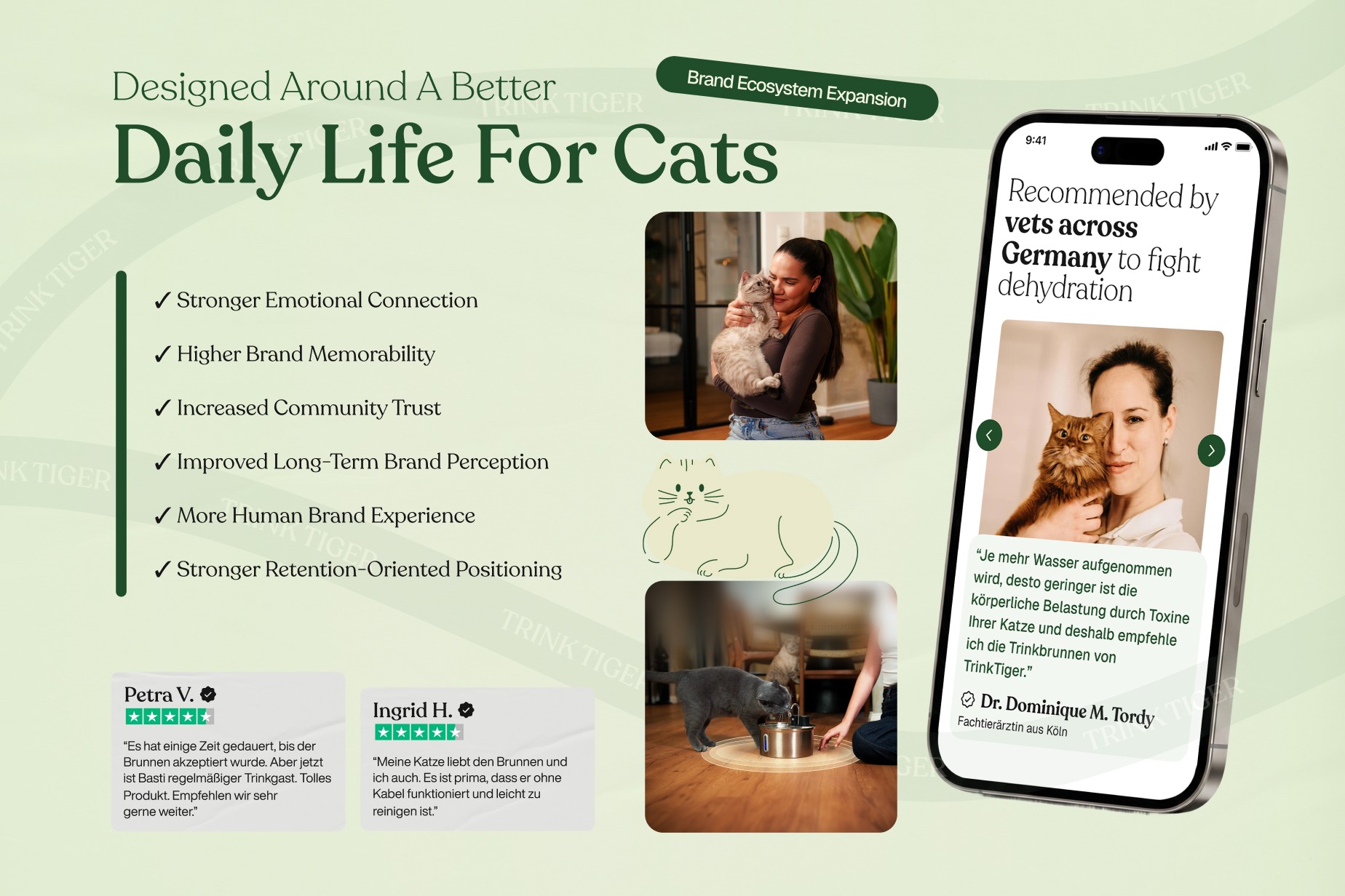
UXphoria's work covered the project from CRO strategy and UX/UI design through Shopify development.
The Relationship Expanded Beyond Ecommerce
The Shopify project became one part of a longer relationship with TrinkTiger.
As the company prepared for a broader product range, UXphoria later worked with the brand again on a separate identity and packaging engagement covering brand foundation, positioning, visual identity and a system designed to extend across future products.
That work is documented separately in the TrinkTiger Brand Book & Identity Design case study.
The two projects solve different problems.
The ecommerce work focused on how customers understand, evaluate and buy TrinkTiger products.
The later brand work focused on how TrinkTiger could remain recognisable as the company and product range expanded.
Selling a Product That Needs More Explanation?
Some Shopify purchases depend on customers understanding the product before they are ready to compare or buy.
UXphoria works across CRO strategy, UX/UI and Shopify implementation to make those buying decisions clearer.