



Anh Vo
Brand Strategist
Table of Contents:
Project Overview
Project: Obsessive Smiles Cosmetic Dentistry Website Redesign
Platform: Responsive Web (Mobile-First)
Services: UX/UI Design, CRO Strategy, User Experience Architecture
Industry: Cosmetic Dentistry / Luxury Healthcare
The Client
Obsessive Smiles is an at-home oral-care brand spanning whitening strips and gels, toothpaste, toothbrushes, replacement heads, bundles, and related daily-care products.
Its digital experience needs to do more than display products. Customers move between different whitening goals, maintenance routines, sensitivity considerations, product formats, research, reviews, and professional credibility before deciding what belongs in their routine.
That made the project as much about decision architecture as interface design.
The goal was to make a broad product range easier to understand while keeping the brand's evidence and expertise visible at the moments where customers actually evaluate what to buy.
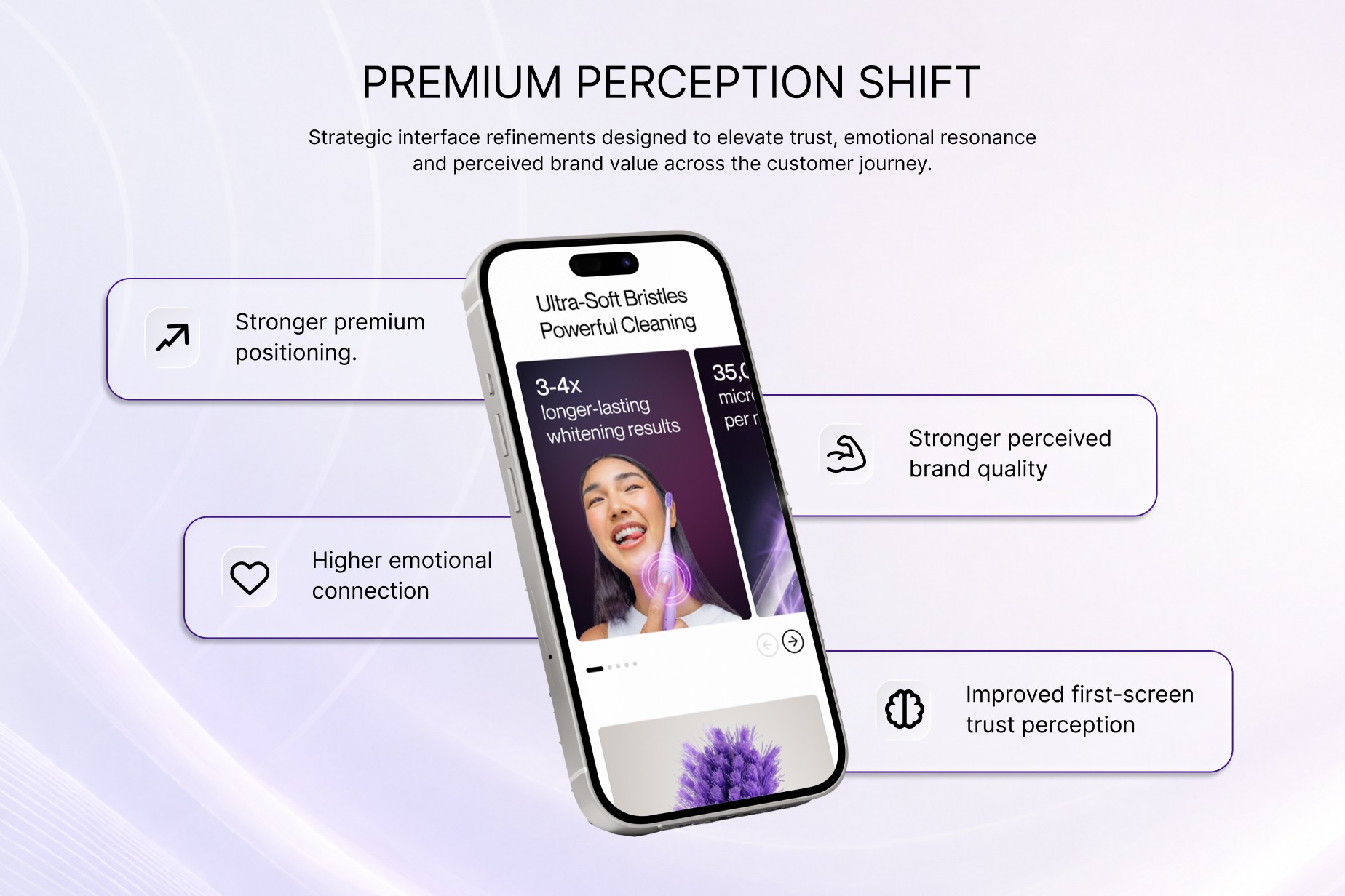
Customers needed to quickly understand what each product is for, how products differ, which routine matches their goal, and what evidence supports the brand's claims.
That same decision-led approach sits behind UXphoria's work in product page optimization, where product information, proof, fit, risk and purchase action are treated as one connected decision journey rather than separate page elements.
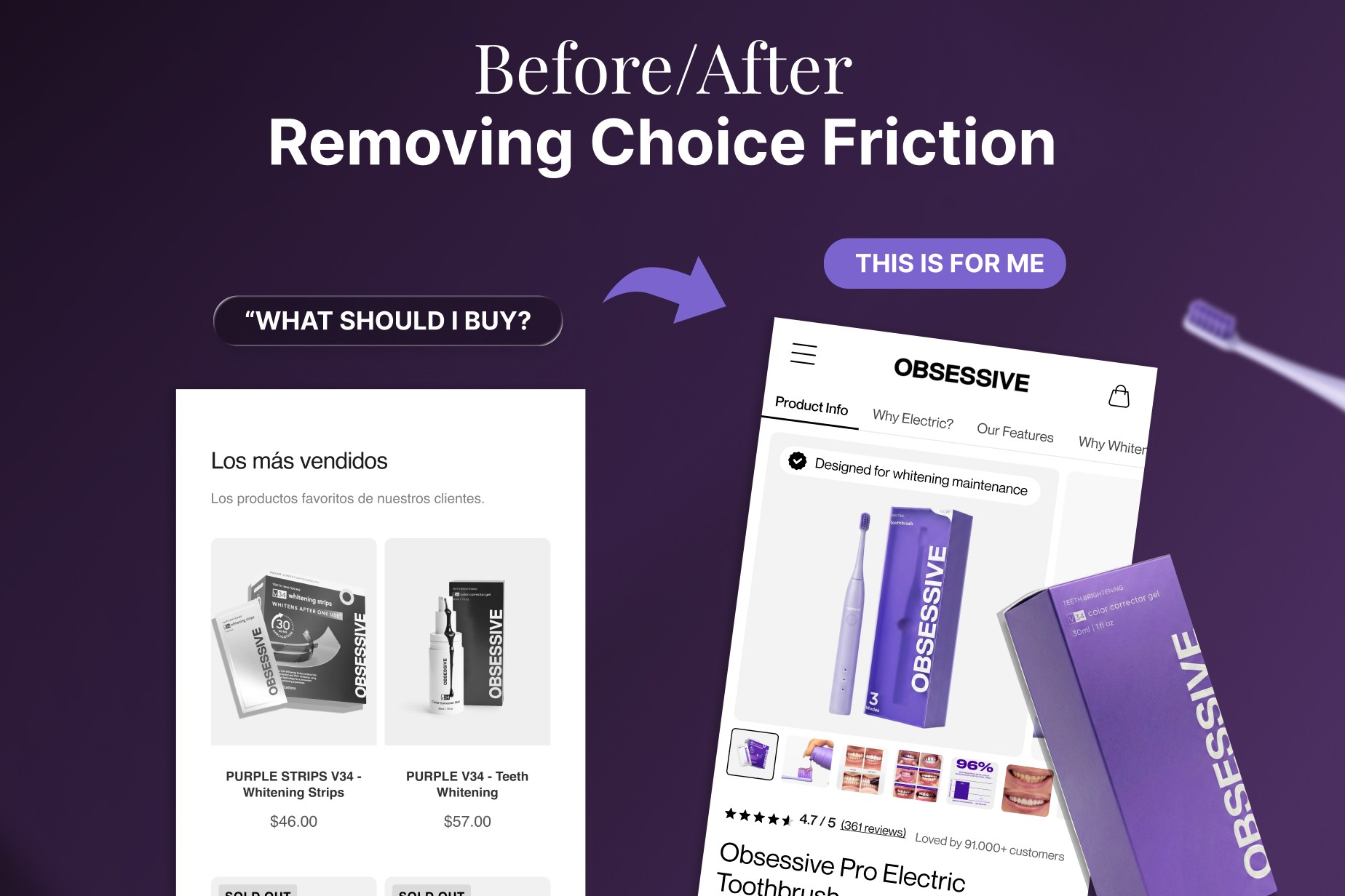
Product choice required too much interpretation
Proof sat too far from key buying moments
Whitening routines were difficult to compare quickly
Research and formulation content needed clearer hierarchy
Mobile screens had to carry dense product information
Repeated information risked cognitive overload
Purchase actions needed more context
Brand personality and clinical credibility needed one system
The Challenge
At-home oral care sits between beauty, everyday routine, and health-adjacent trust.
A customer may arrive knowing they want whiter teeth without knowing whether that means intensive strips, maintenance gel, toothpaste, a bundle, or a combination of products.
The redesign therefore had to make product choice feel simple without making the information behind that choice simplistic.
1. Product Choice Was a Decision Problem, Not Just a Catalogue Problem
Customers were not simply choosing between SKUs.
They were choosing between goals:
Intensive whitening.
Maintenance.
Daily care.
Sensitivity.
Convenience.
Routine combinations.
The experience needed to answer four questions quickly:
What is this product for?
Is it right for my current goal?
How does it differ from the next option?
What should I use with it?
This became one of the central principles behind the product-page work: the PDP should help someone make a decision, not simply contain more information.
2. Proof Had to Support Product Choice
Obsessive Smiles uses research, formulation expertise, certifications, professional credibility, customer reviews, and visual results as part of its product story.
The challenge was not simply adding more proof.
It was deciding when each type of proof becomes useful.
Research belongs where customers question credibility. Reviews belong where they want reassurance from other buyers. Product-specific evidence belongs near the claim or decision it helps support.
This meant shifting from a collection of trust elements toward a more deliberate proof hierarchy.
3. Results Needed Context
Before-and-after imagery immediately attracts attention, but imagery alone does not necessarily help someone understand which product produced the result, what routine was followed, or whether that product fits their own goal.
The redesign therefore treated results as part of the buying journey rather than as a disconnected gallery.
Customer evidence, product context, educational information, and purchase options were brought closer together so that proof could help answer a decision rather than simply decorate the page.
4. Mobile Had to Carry the Same Decision Support in Less Space
A product page may need to accommodate:
product imagery,
claims,
price,
product options,
proof,
reviews,
instructions,
bundles,
FAQs,
and purchase controls.
On a small screen, these elements all compete for attention.
The mobile experience therefore required its own hierarchy.
Rather than compressing the desktop experience, the interface prioritised the moments most important to product understanding and purchase progression.
This is the same small-screen problem UXphoria addresses more broadly through mobile Shopify CRO: preserving purchase momentum while deciding what deserves attention first on a constrained screen.
5. Science and Personality Had to Feel Like the Same Brand
Obsessive Smiles does not behave like a traditional clinical oral-care brand.
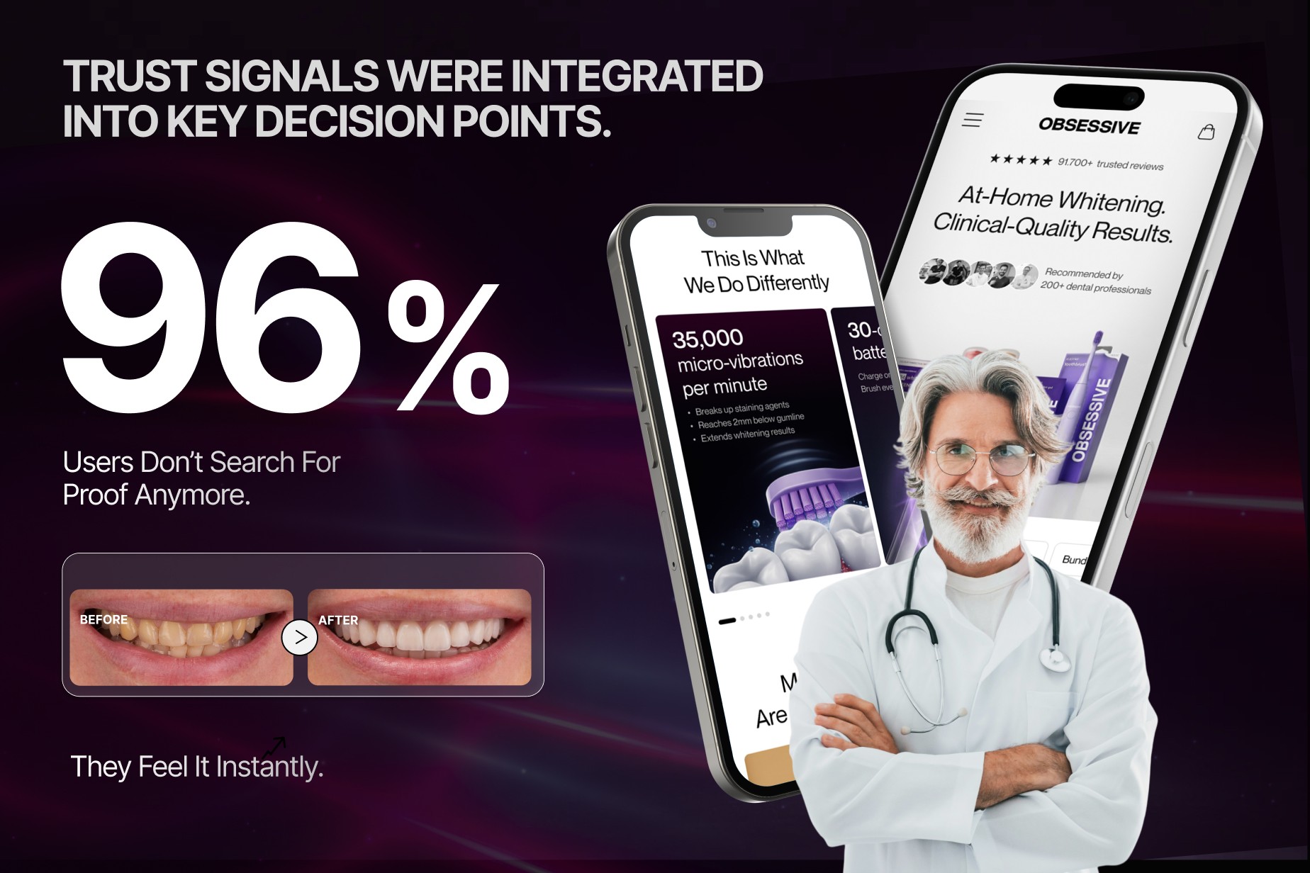
Colourful products, creator content, customer imagery and a more expressive consumer identity sit alongside research, formulation expertise and professional credibility.
The interface therefore needed enough structure to make the evidence feel credible without stripping away the character that makes the brand recognisable.
The Solution
The redesign connected product discovery, education, proof and purchase action into one e-commerce system.
Instead of treating the homepage, collection experience, product pages and research content as isolated surfaces, we designed them around different stages of the same buying decision.
The broader principle was simple:
Help customers understand what they need, give them the evidence required to trust that decision, then make the next action obvious.
That is also how UXphoria approaches broader Shopify CRO: not as isolated button changes, but as a connected buying journey spanning understanding, trust, momentum and decision-making.
The Process
Phase 1: Product Story & Brand Alignment
The first step was creating clearer roles for products within the wider Obsessive Smiles range.
The experience was organised around customer goals and product use rather than relying only on conventional catalogue structure.
Messaging and hierarchy focused on:
whitening goal
routine stage
product differences
evidence
expertise
supporting products
The visual system then gave those relationships a more consistent structure across page types.
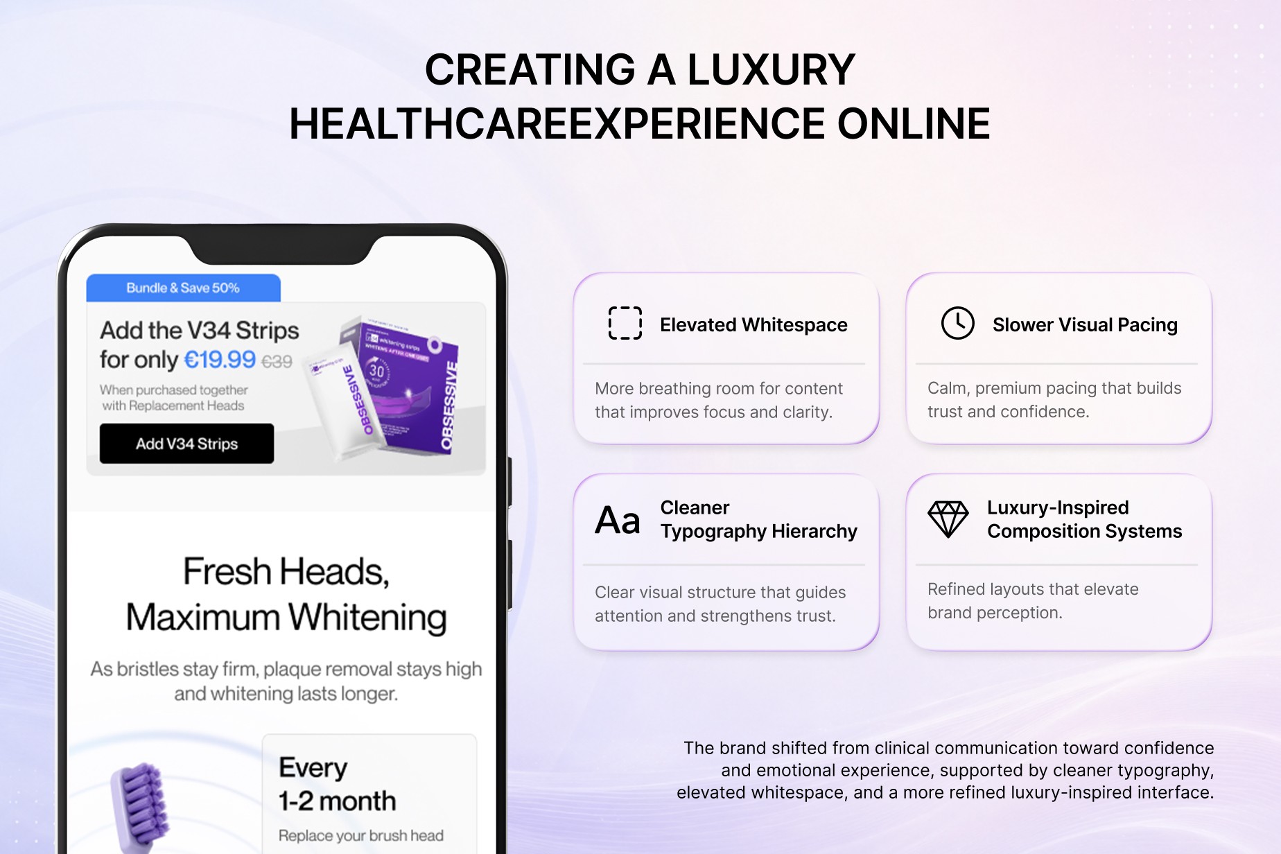
Delivered shift
Product roles become easier to distinguish
Brand and evidence content share one visual system
Claims appear with clearer supporting context
Education and purchase action feel connected
Phase 2: Evidence & Trust Architecture
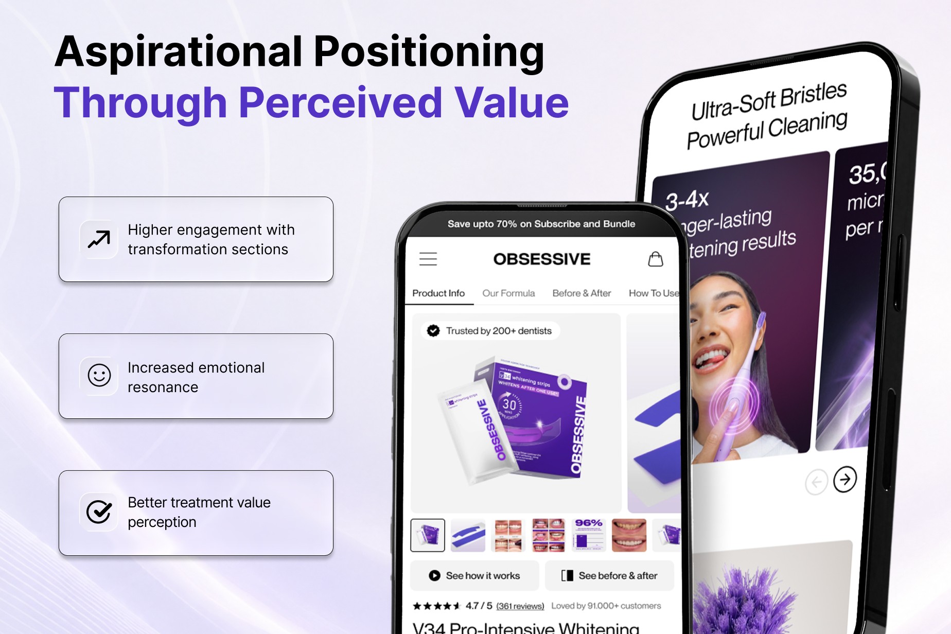
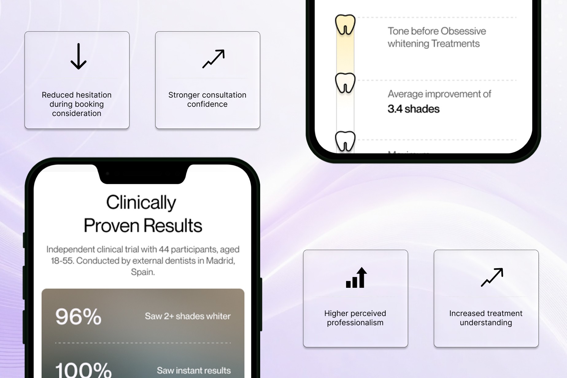
Research, certifications, formulation expertise, reviews and professional credibility were moved closer to the questions customers encounter while evaluating products.
Instead of asking every page to communicate every credibility signal at once, evidence was distributed according to the decision it supported.
Research could explain why a formulation deserves attention.
Professional expertise could strengthen confidence in the product-development story.
Reviews and visual results could help customers understand real-world product use.
FAQs could resolve remaining objections without interrupting the main buying journey.
Delivered shift
Evidence is connected to specific product questions
Expertise stays visible without overwhelming product content
Long explanations become easier to scan
Trust content remains accessible across desktop and mobile
Phase 3: Results Storytelling & Product Fit
The redesign connected visual results more closely to product and routine context.
Instead of showing a transformation and leaving customers to interpret it themselves, supporting content could explain which product or routine the result belongs to, how the product is used, and where it sits within the wider range.
That gives customer evidence a clearer commercial role.
It helps move the question from:
"Does this look impressive?"
to:
"Is this the product that fits what I want?"
Phase 4: Mobile UX & Purchase Flow
The mobile experience was designed around progressive understanding.
Customers first need enough information to recognise the product and its role.
Then they need evidence.
Then product options.
Then confidence to act.
Supporting information remains available, but it does not all compete for the opening screen.
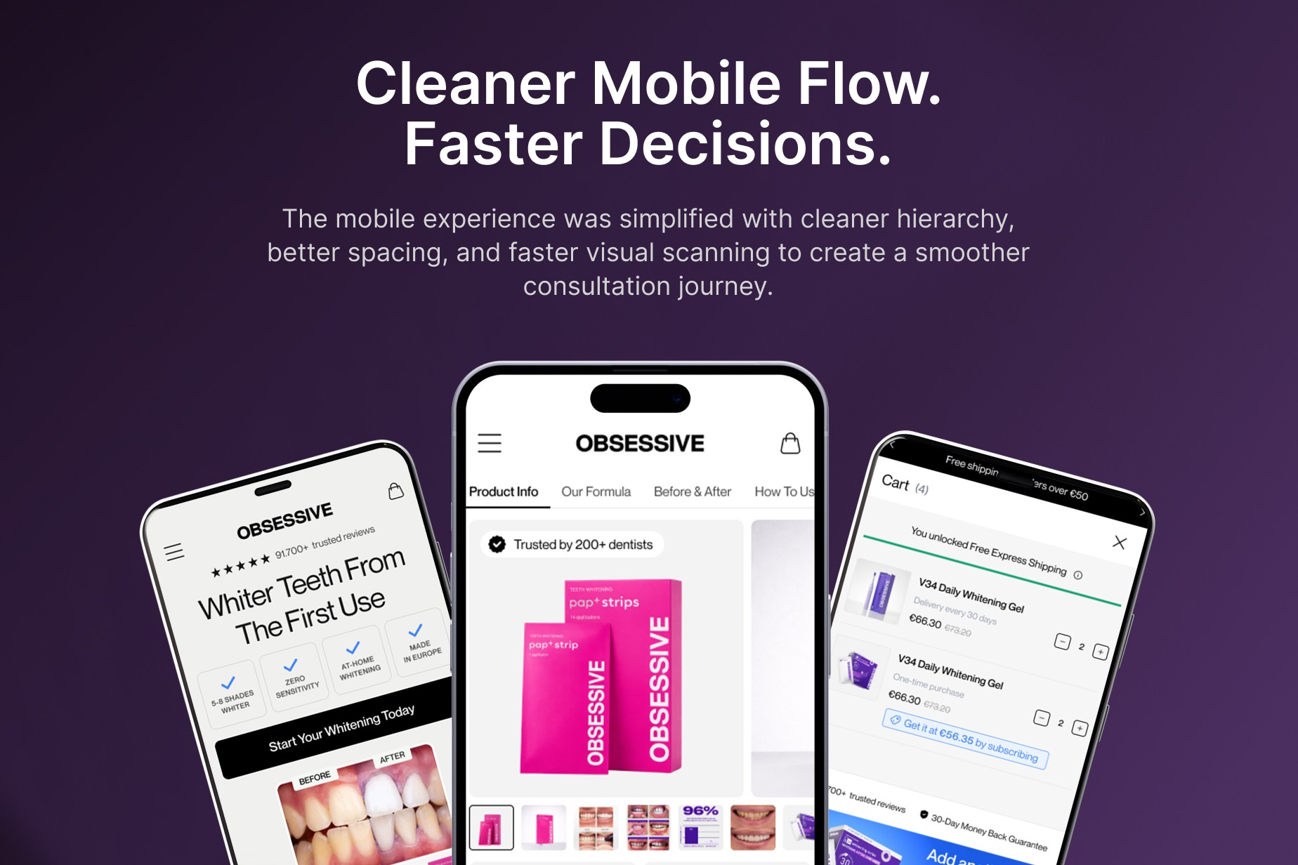
This approach influenced:
media hierarchy
product title and price visibility
product options
purchase controls
proof modules
reviews
use guidance
FAQs
supporting recommendations
The result is not simply a responsive version of the desktop page. It is a buying sequence designed around small-screen behaviour.
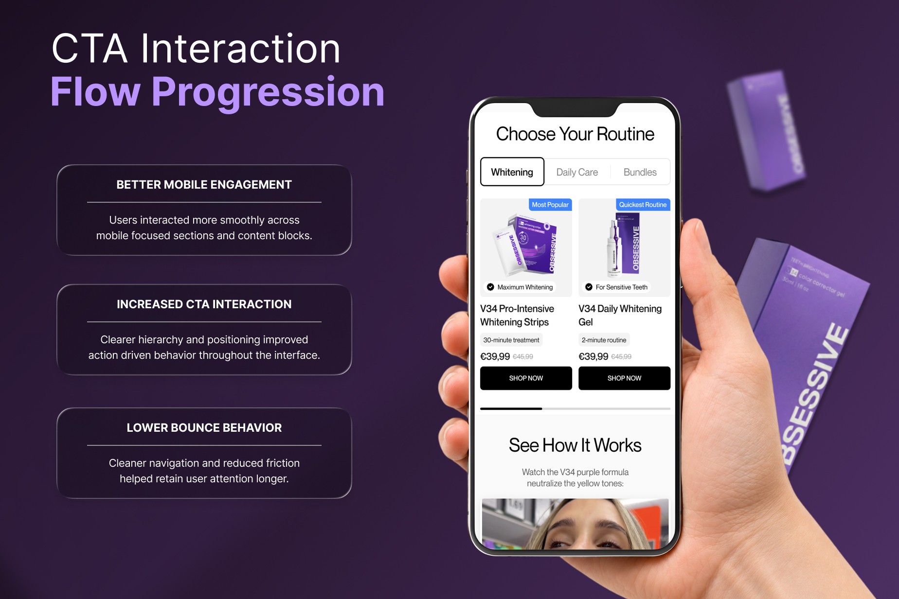
Phase 5: Conversion-Focused Product Architecture
Individual PDP improvements were connected to a broader shopping system.
The store needed to support customers who already knew the product they wanted, but also customers arriving with a problem or goal.
That meant supporting several paths into the catalogue:
Shop by category
Shop by goal
Understand a routine
Compare products
Explore research
Move directly into a specific PDP
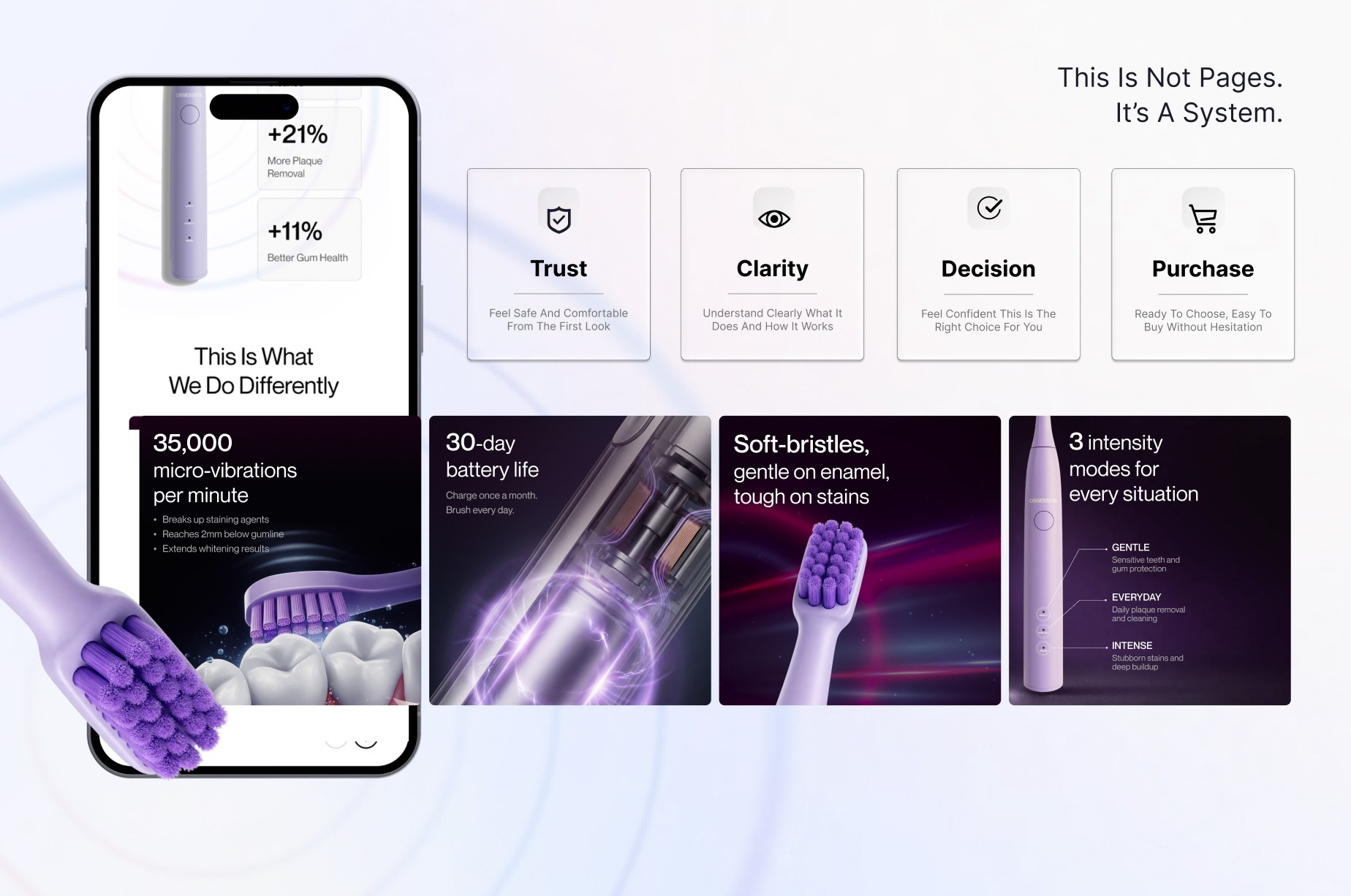
Inside product pages, the structure then moves from recognition into value, evidence, fit, reassurance and action.
This is where the project most closely overlaps with UXphoria's dedicated product page optimization service: reducing the amount of interpretation required between landing on a PDP and feeling confident enough to choose.
What the Redesign Delivered
What the Redesign Delivered
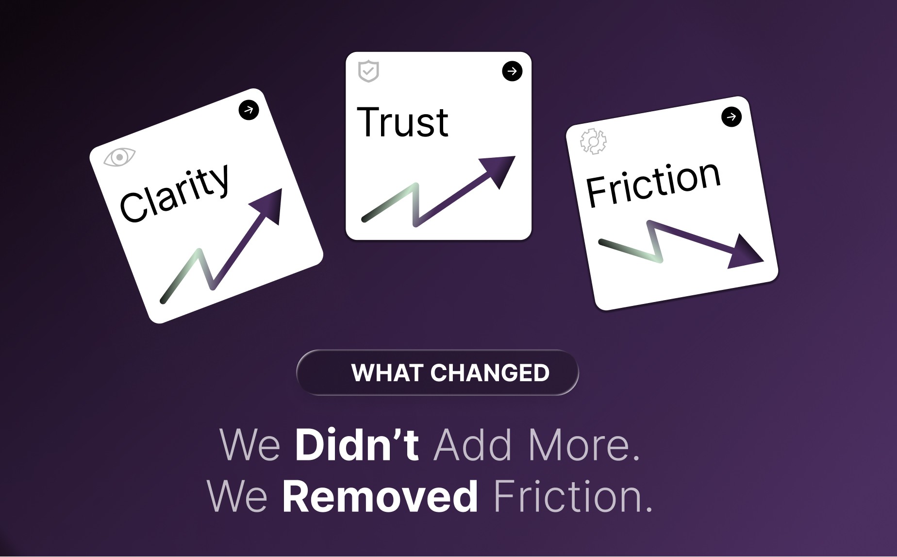
The redesigned experience brings product discovery, education, proof and purchase action into one connected responsive system.
Instead of relying on one oversized persuasion claim, the experience gives customers several ways to understand:
what a product is
who it is for
how it differs
how it fits into a routine
what evidence supports it
what they should do next
The delivered experience includes responsive homepage and collection experiences, product pages combining education and purchase support, research and brand content connected to commerce, mobile-first information hierarchy, and reusable product and evidence patterns across whitening and daily-care products.
The result is a more coherent foundation for an expanding oral-care catalogue without requiring every product page to solve the same communication problem from scratch.
Future Considerations
The existing system creates room for deeper decision support as the product range and evidence library evolve.
Potential future extensions could include a guided routine finder, richer side-by-side product comparison, an expanded research library, post-purchase product education, and stronger replenishment or routine-completion journeys.
Those would be extensions of the existing architecture rather than reasons to redesign the experience again from zero.
Where a brand is unsure whether the main problem sits in its PDPs, mobile journey, broader store architecture or another stage of the funnel, UXphoria also approaches that question through a conversion audit before prescribing a redesign.
Ready to Make a Complex Product Easier to Buy?
Obsessive Smiles shows what happens when product education, evidence, mobile hierarchy and purchase action are treated as parts of the same customer decision.
For brands facing similar product-choice and conversion problems: