
Guest Writer
Min Bui
Table of Contents:
Project Overview
Disclaimer: This project was completed by Min Bui as a UX/UI designer, working with an external agency on a website redesign for AYO.
This project was completed prior to the founding of UXphoria.
Work was delivered as a contracted designer through a third-party agency.
UXphoria was not directly engaged with the client.
Project: AYO Light Therapy Glasses Website Redesign
Role: UX/UI Design, CRO Strategy (as part of an agency team)
Engagement: Contracted via third-party agency (Upwork)
Note: UXphoria was not involved in this project. This case study reflects individual work prior to founding the studio.
Timeline: Pre-UXphoria

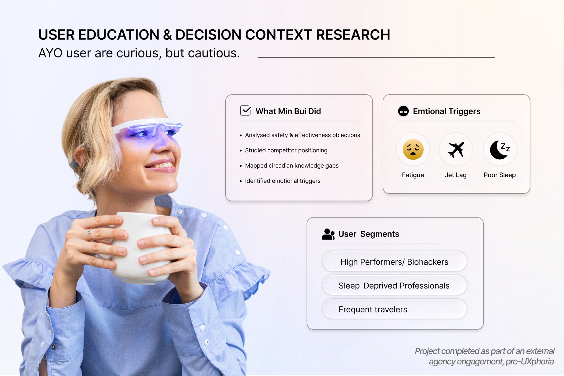
The Client
AYO is a health-tech brand focused on improving sleep, energy, and circadian rhythm alignment through wearable light therapy.
The core issue was not the product.
It was how the product was understood.
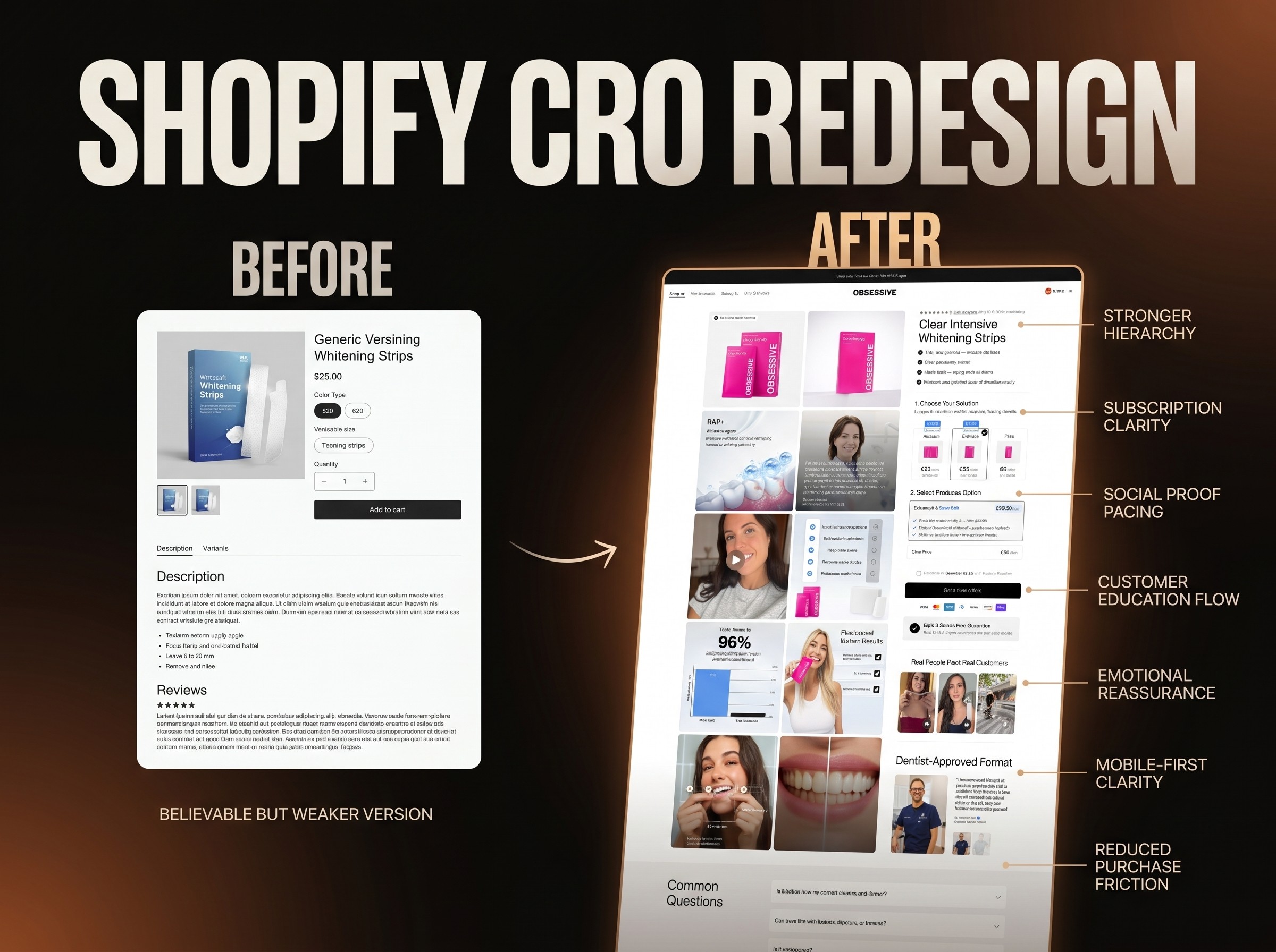
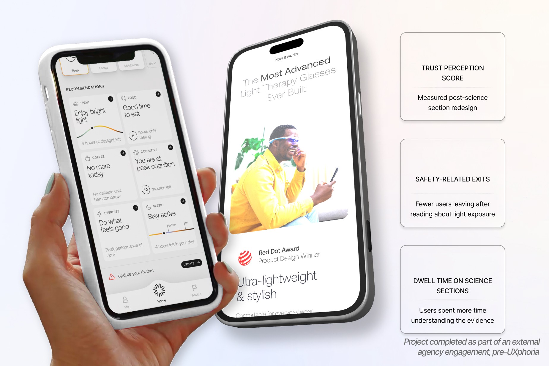
Despite strong scientific backing, the website did not translate complex circadian science into something users could quickly grasp and trust, especially on mobile.
Product felt “techy” but hard to understand
Too much scientific explanation too early
Benefits (sleep, energy, mood) weren’t connected to daily life
App value was under-communicated
Visitors questioned safety and effectiveness
Mobile users bounced before reaching clarity
The Challenge
Health-tech conversion fails when clarity lags behind curiosity.
1. Circadian Science Is Hard to Explain Quickly
Most users aren’t familiar with:
Circadian rhythm
Light timing
Blue light therapy
Without simplification, the product felt complex and intimidating.
2. Wearables Require Strong Trust Signals
People won’t put a device on their face unless they trust:
Safety
Scientific validity
Long-term use benefits
The site didn’t build that trust fast enough.
3. Hardware + App Value Was Fragmented
The glasses and the app were explained separately.
Users didn’t immediately understand:
“Why does the app matter?”
4. Lifestyle Benefits Needed Clear Framing
Users cared about:
Sleeping better
Feeling less jet-lagged
Having more energy
But the website focused too much on how it works, not how it feels.
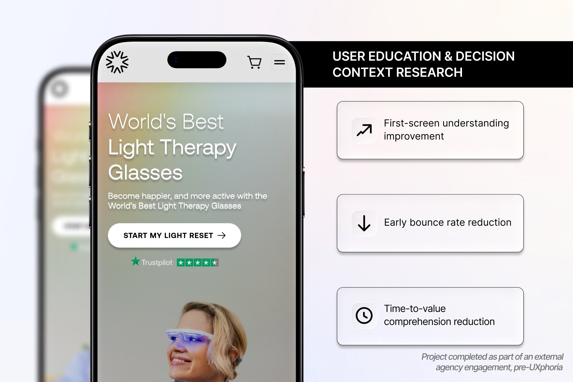
5. Mobile Attention Windows Were Extremely Short
Most traffic came from:
Mobile ads
Biohacking communities
Social media
The first 5–7 seconds decided everything.
The Solution
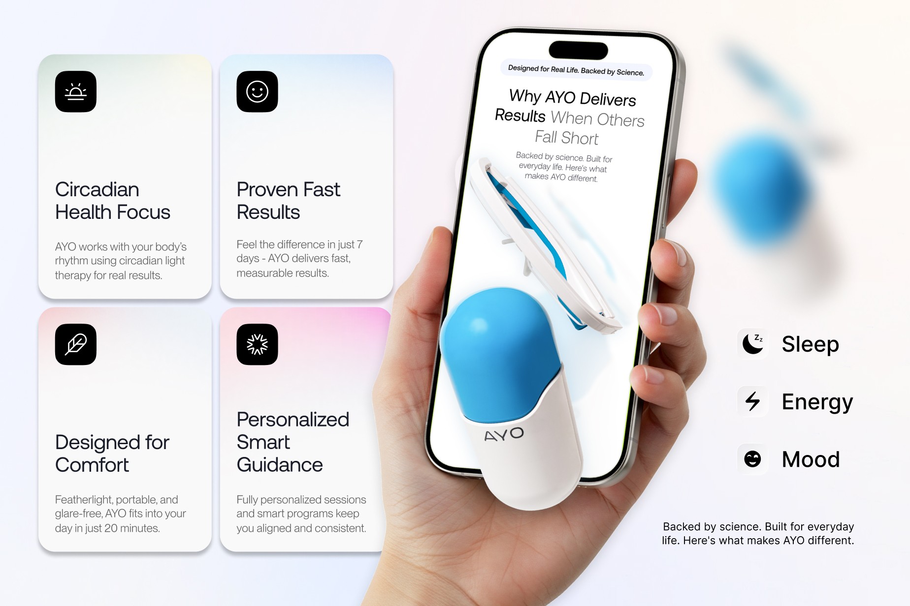
1: Product Story Restructuring
Reframed the product as:
Daily light therapy without changing your routine
Structured benefits clearly:
Sleep
Energy
Mood
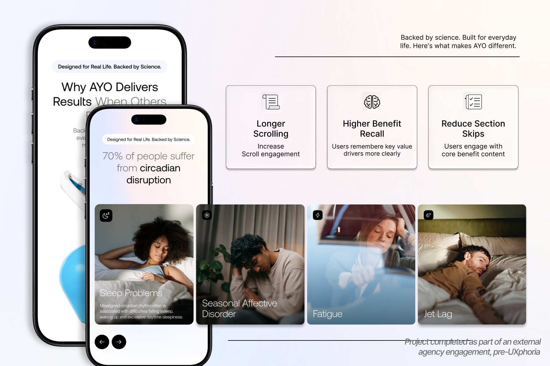
2: Science Simplification
Visualized circadian rhythm with simple diagrams
Clarified safety, UV-free and controlled exposure
Added structured FAQs to reduce anxiety
Shifted perception from complex tech to understandable, evidence-based system.
3: Trust Architecture
Introduced reassurance near key decision points
Reinforced safety and credibility early
Structured content to reduce hesitation step by step

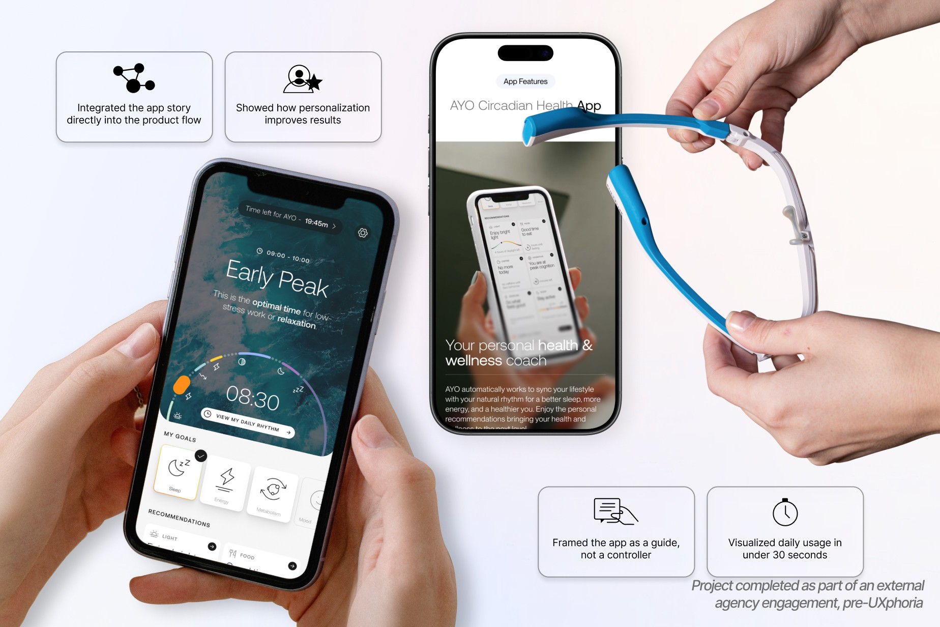
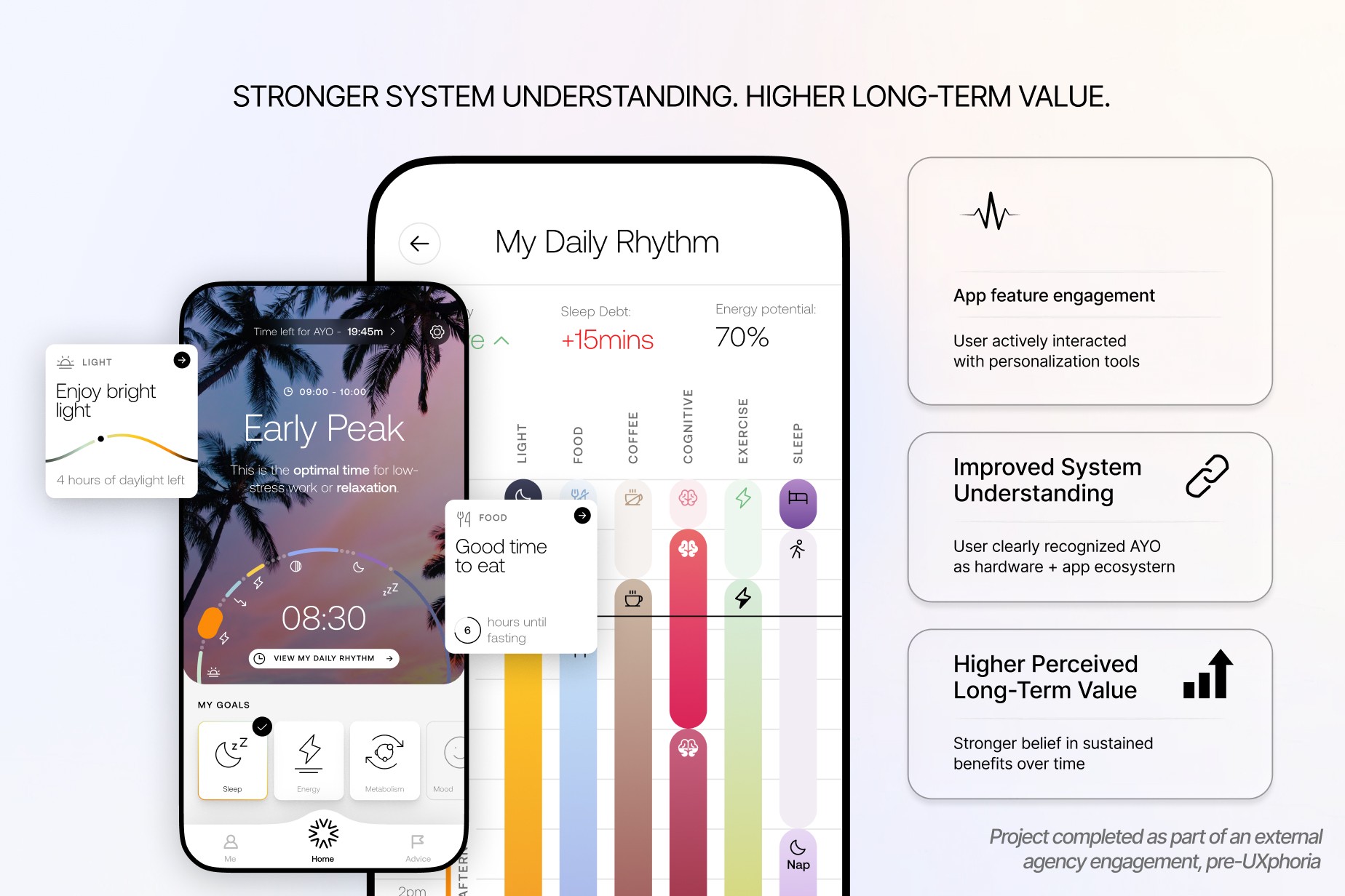
Phase 4: App + Hardware Value Integration
Positioned AYO as a system, not just a device.
Integrated the app into the product journey
Showed how personalization improves results
Demonstrated daily usage simply
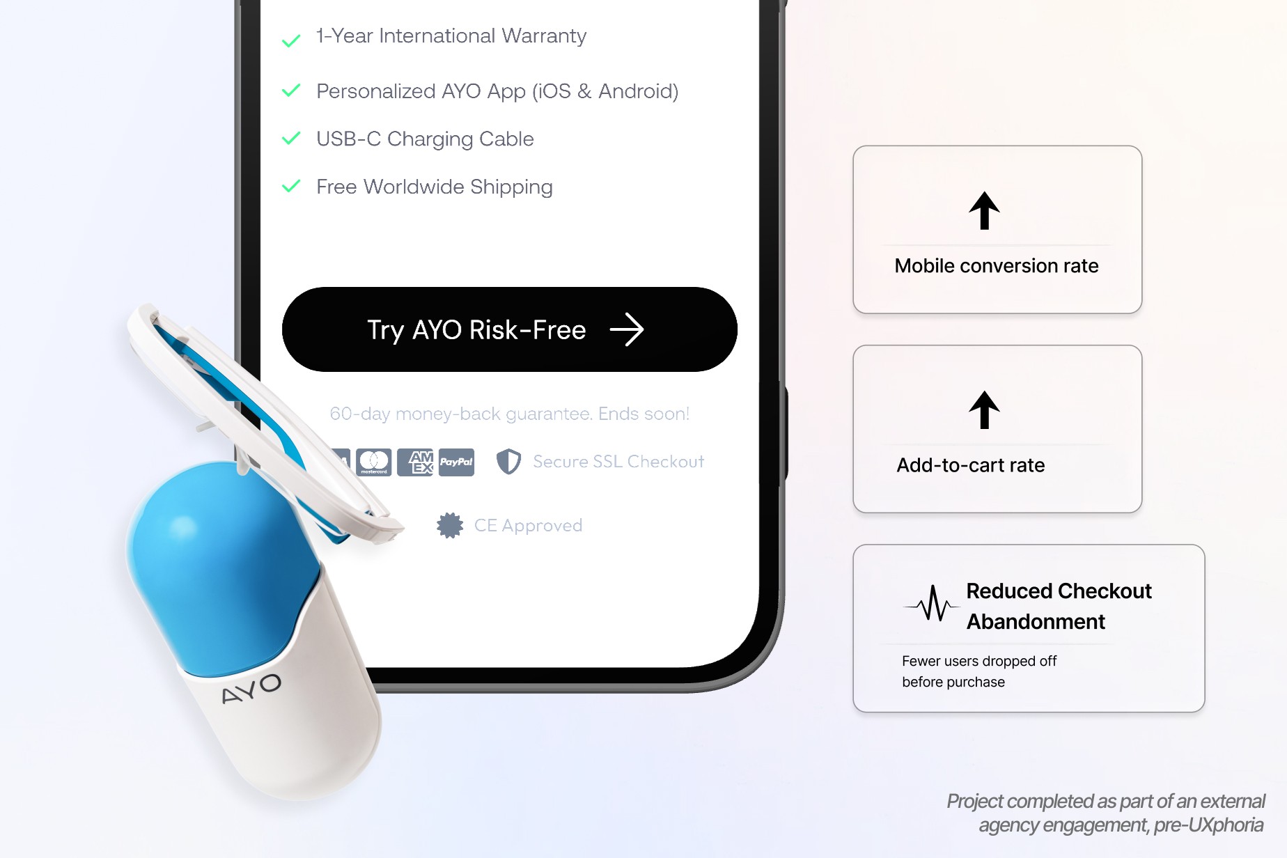
Phase 5: CRO, Mobile UX & Purchase Confidence
Optimized layout for fast scanning
Simplified CTA structure
Reduced friction at key moments
Reinforced ease of use, hands-free and short sessions

The Outcome
The redesigned experience improved clarity, confidence, and overall decision flow.
Users were able to understand the product faster, trust it more easily, and engage more deeply with both the device and its supporting system.
The limiting factor was not the product.
It was the time required to understand it.
When clarity improved early in the experience:
hesitation decreased
trust increased
decision-making became easier

Future Considerations
Health-tech products do not fail because they lack value.
They fail when that value is not understood quickly enough.
Effective product pages must:
simplify complex ideas without losing credibility
connect features to real-life outcomes
build trust before asking for commitment