


Dung Tran
Visual Designer
Table of Contents:
Project Overview
TrinkTiger is a growing cat-care brand expanding from a hydration-focused product into a broader cat wellness ecosystem.
The goal was to create a clear, recognisable identity that could grow with the brand, support new product categories and give customers a more consistent sense of care across every touchpoint.



Brand Foundation
Mission
Our mission is to help cats live healthier, happier lives through simple, well-designed products that give people more confidence in everyday care.

Brand Values
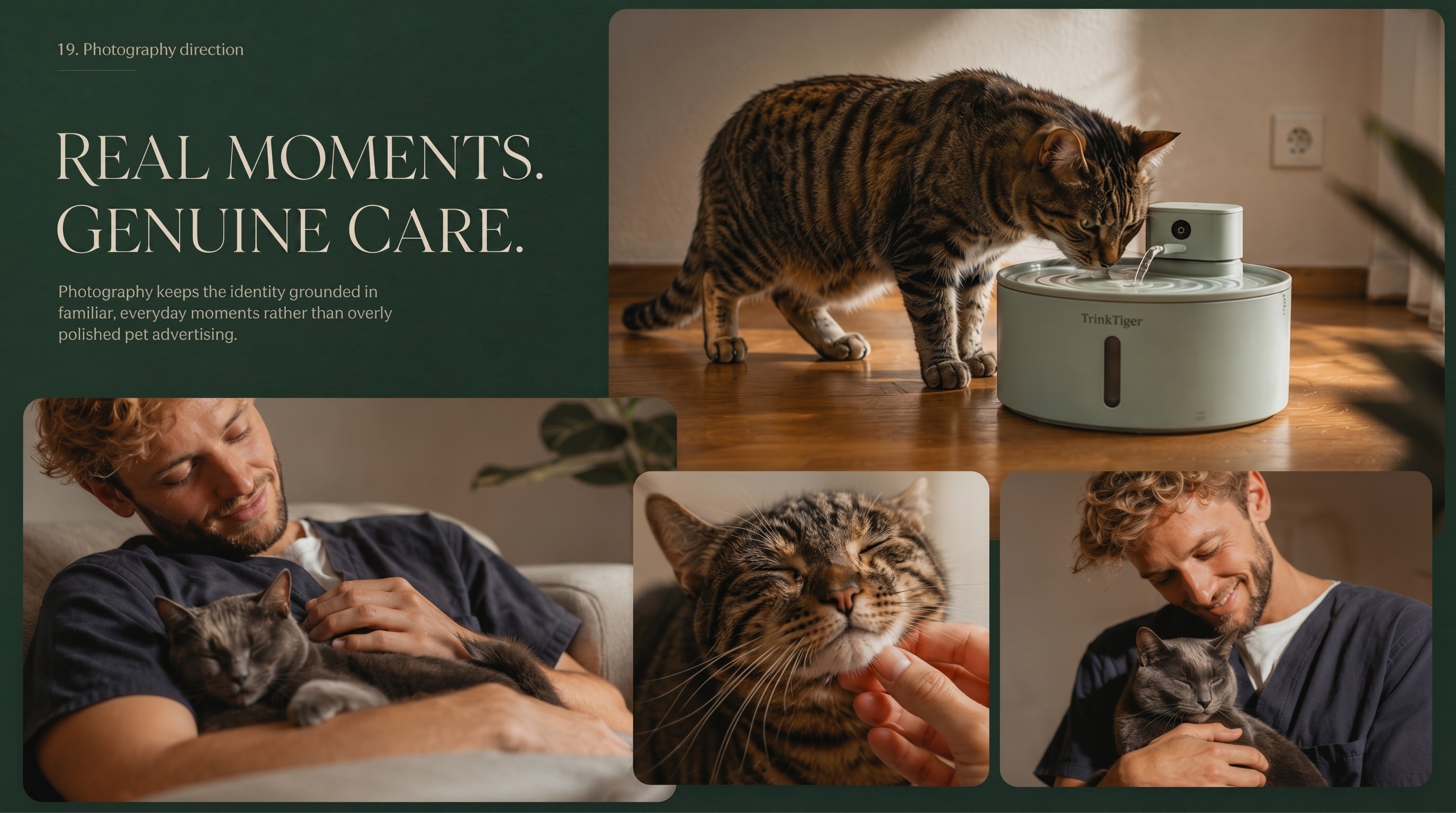
TrinkTiger’s values shape how the brand thinks, designs and communicates. They guide decisions across products and touchpoints, with a consistent focus on care, clarity and trust.
We design every product with a simple goal: to support a long, healthy life for cats. Smart engineering, thoughtful details and genuine care should make everyday wellness feel natural, not complicated.
Good health should not feel like extra work. From quiet pumps and hygienic stainless-steel surfaces to easy-to-give supplements, the range is designed to make daily care simpler.
Veterinary insight, science and German engineering are balanced with a friendly, human tone. The aim is to build confidence without making care feel clinical or overwhelming.
Looking after a cat should feel reassuring, not stressful. Simple products, clear guidance and a calm brand experience help make everyday care easier to navigate.

Brand Strategy & Positioning
TrinkTiger sits within the cat wellness and pet care category, with a focus on proactive everyday care rather than a clinical treatment mindset.
The brand speaks to cat owners who want to make thoughtful choices for their pets without adding more complexity to daily life. Its role is calm and knowledgeable, grounded in expertise while remaining approachable.
For a long and healthy cat life

Visual Identity System
Following the brand workshop, TrinkTiger needed an identity that could support its move from a single hydration product to a broader wellness brand.
The system was designed to be practical for the team, scalable across future products and consistent enough to build recognition over time.


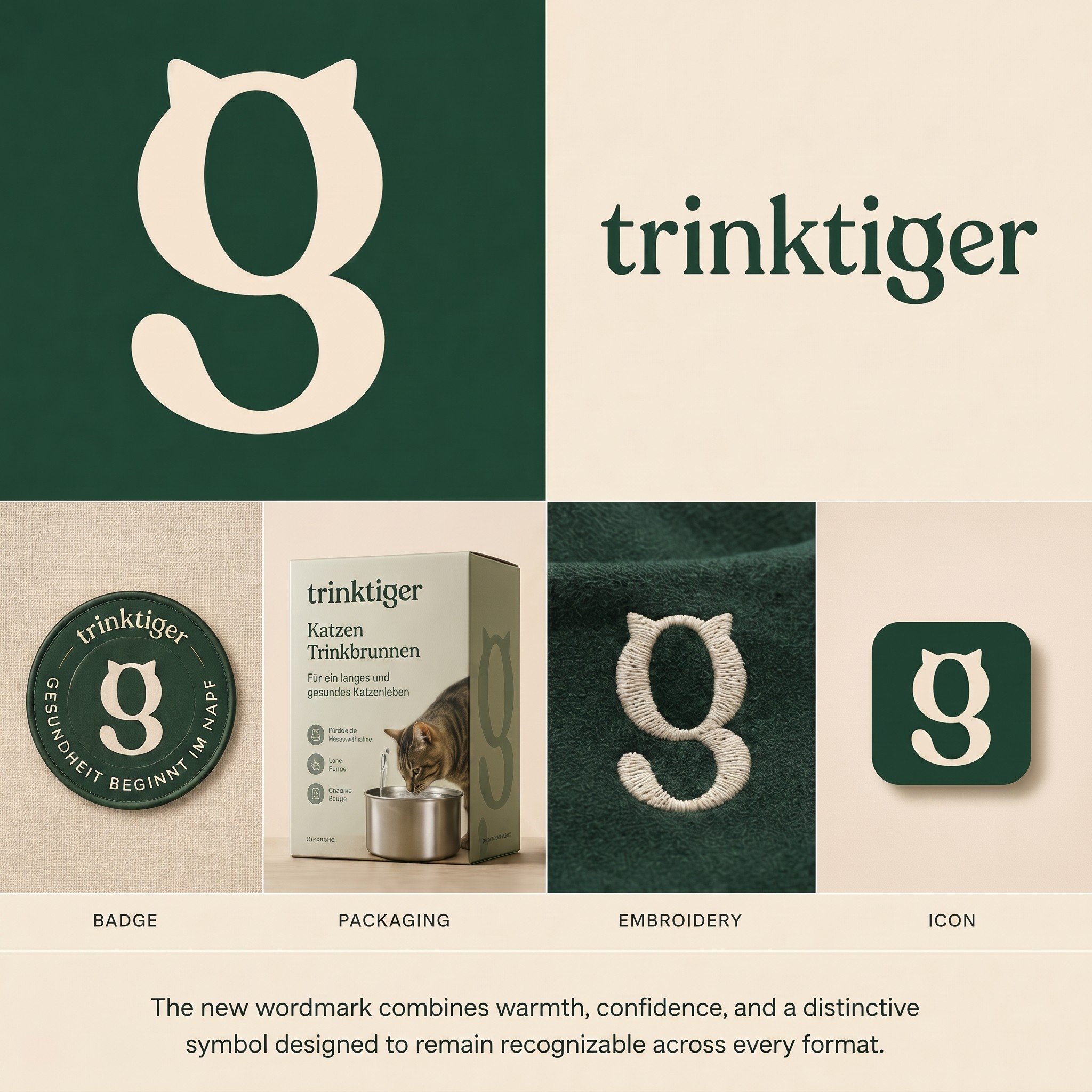
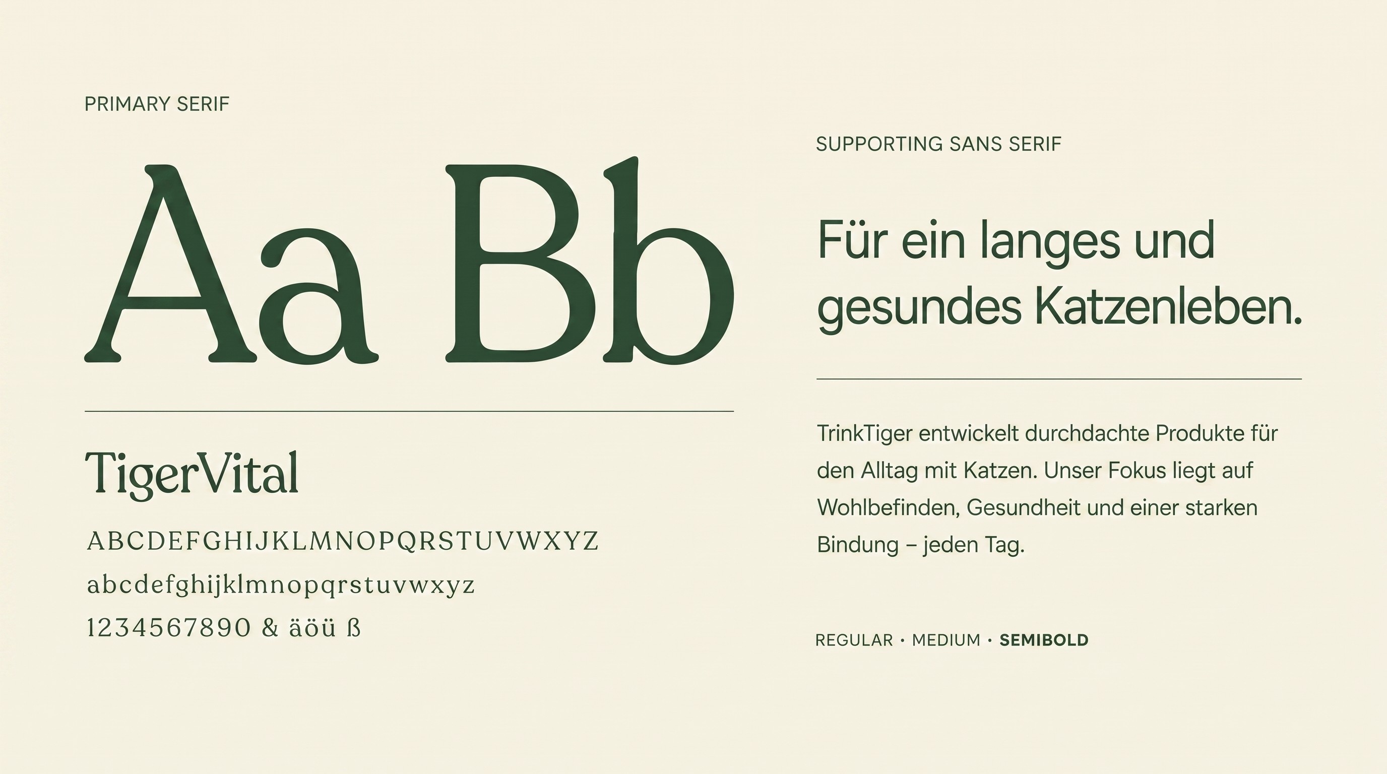
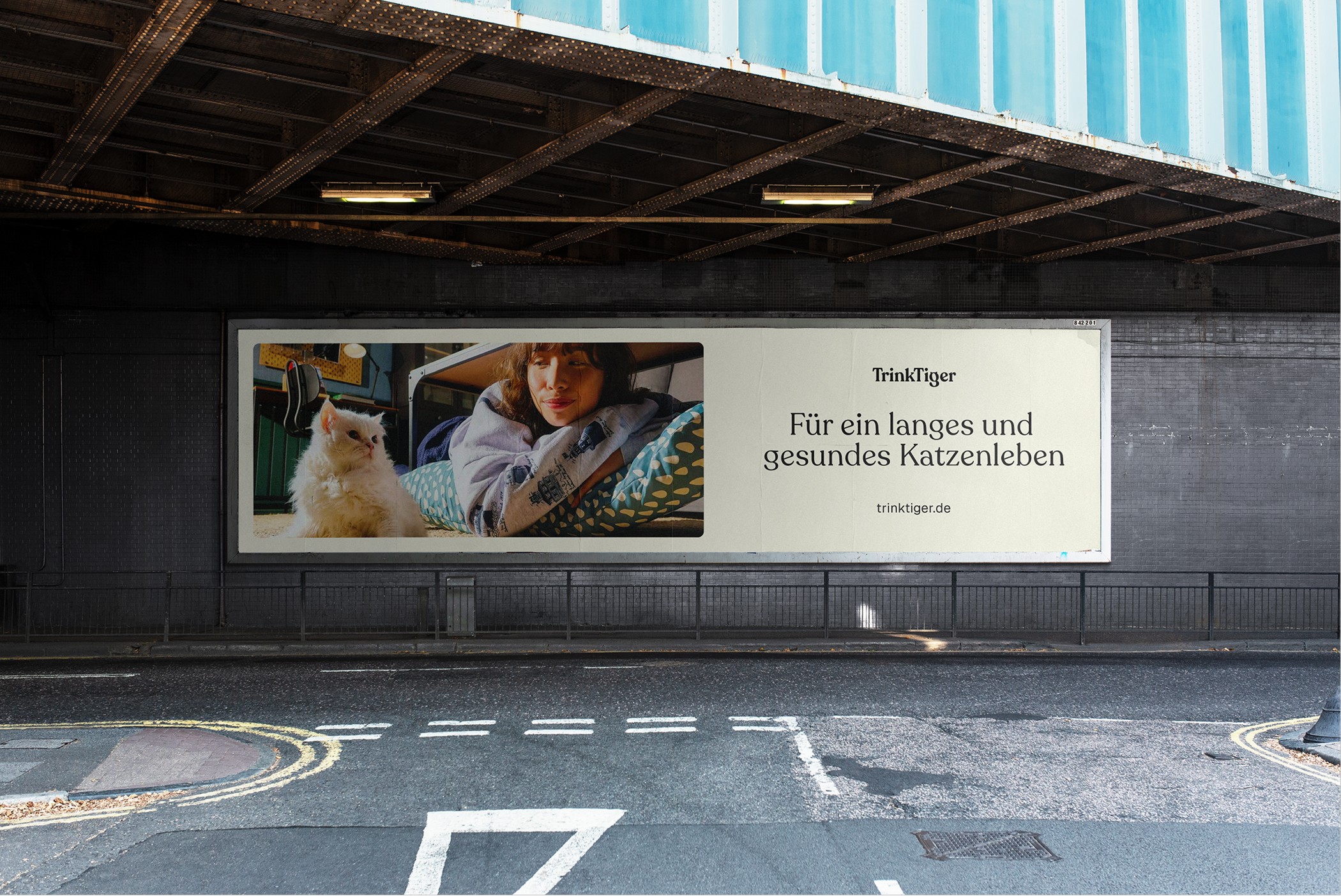
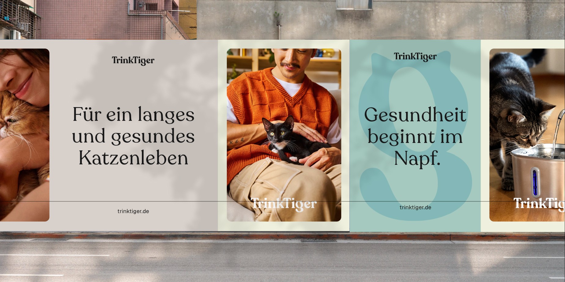
At the centre of the system is a refined wordmark with a softer serif style. It brings warmth, approachability and personality to the brand without losing clarity.
The shift supports TrinkTiger’s move into a broader wellness space while giving the identity a more distinctive presence.
The wordmark can scale across digital, packaging and print, holding attention in hero moments and stepping back when the product or message needs to lead.


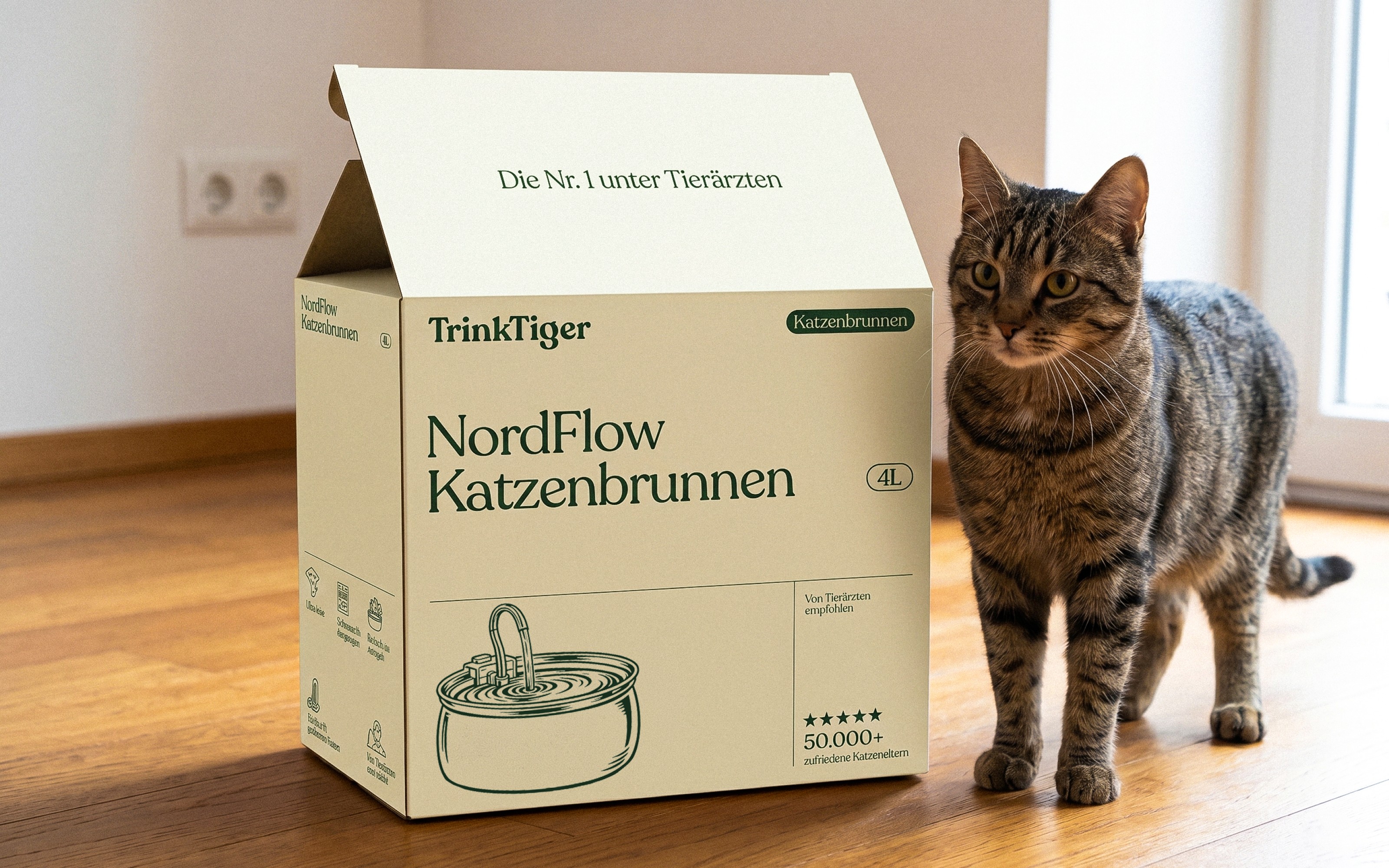


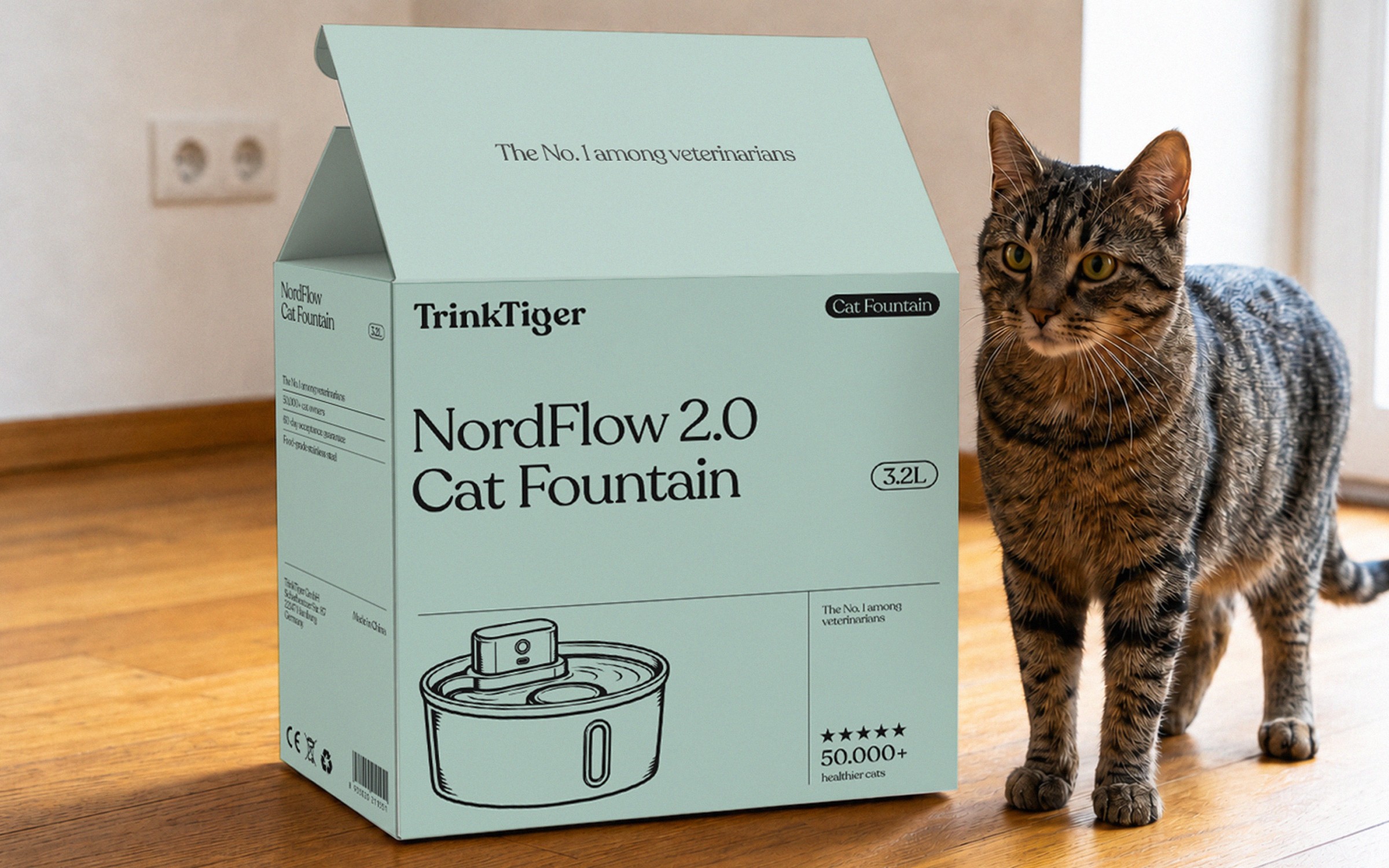

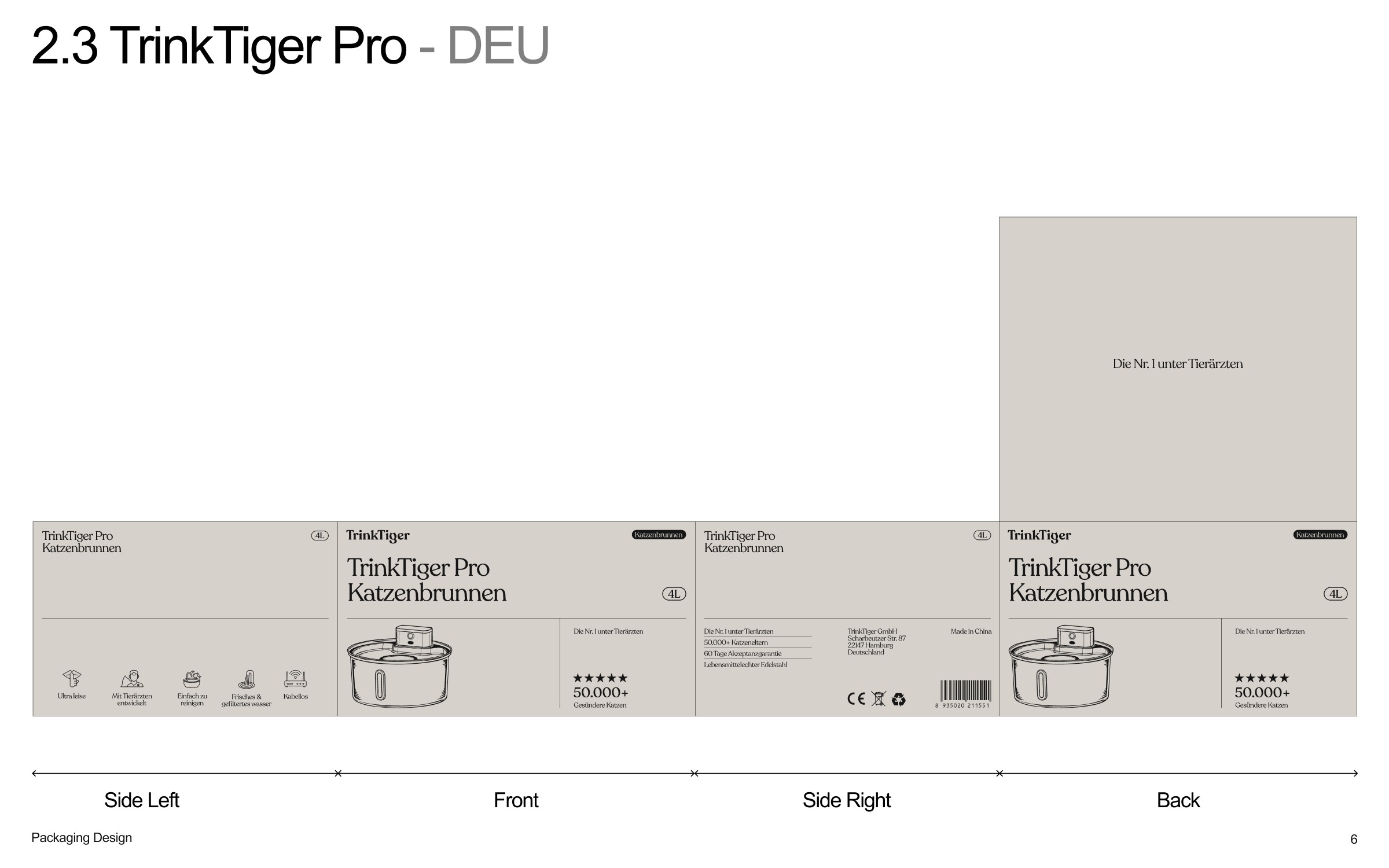
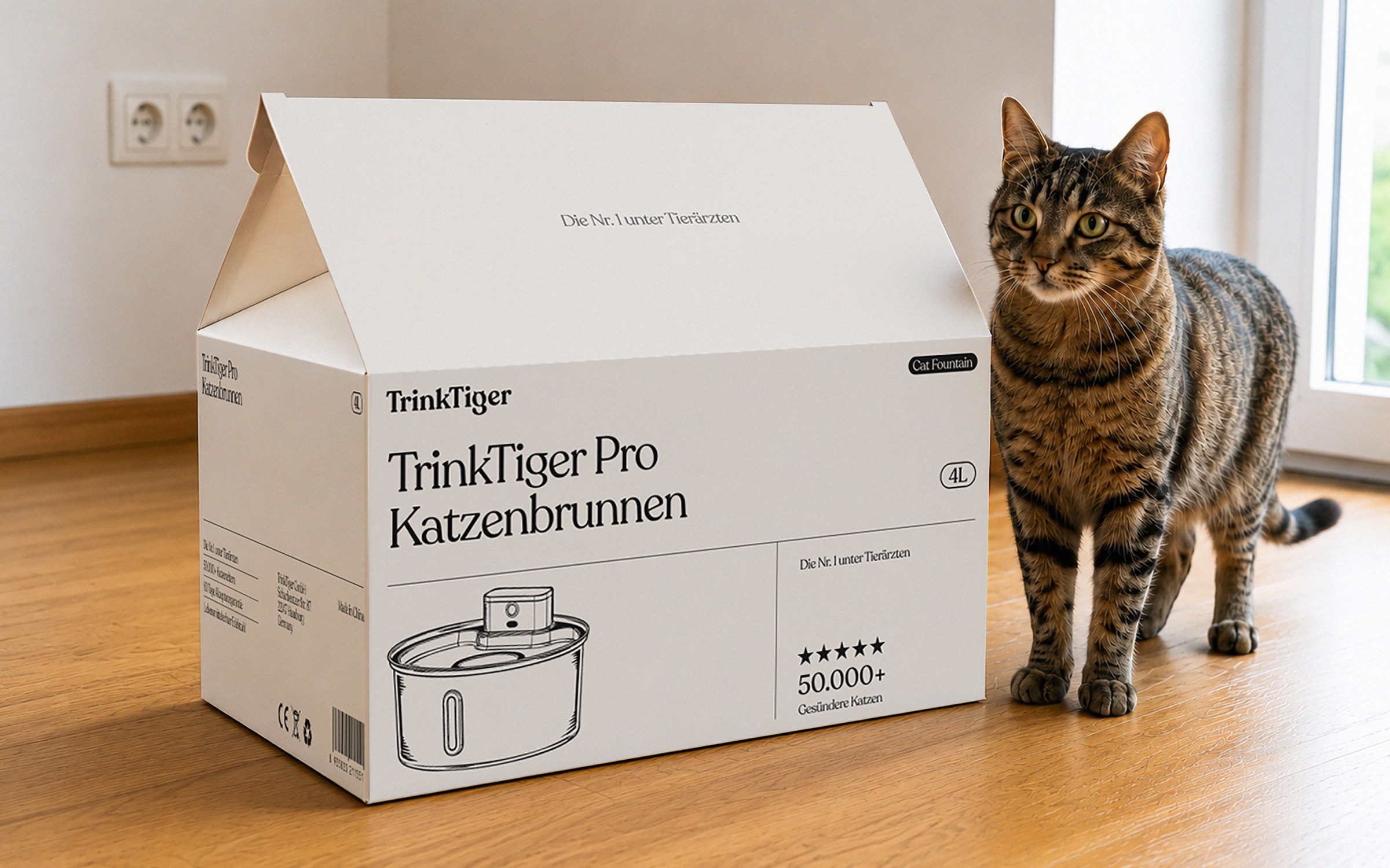

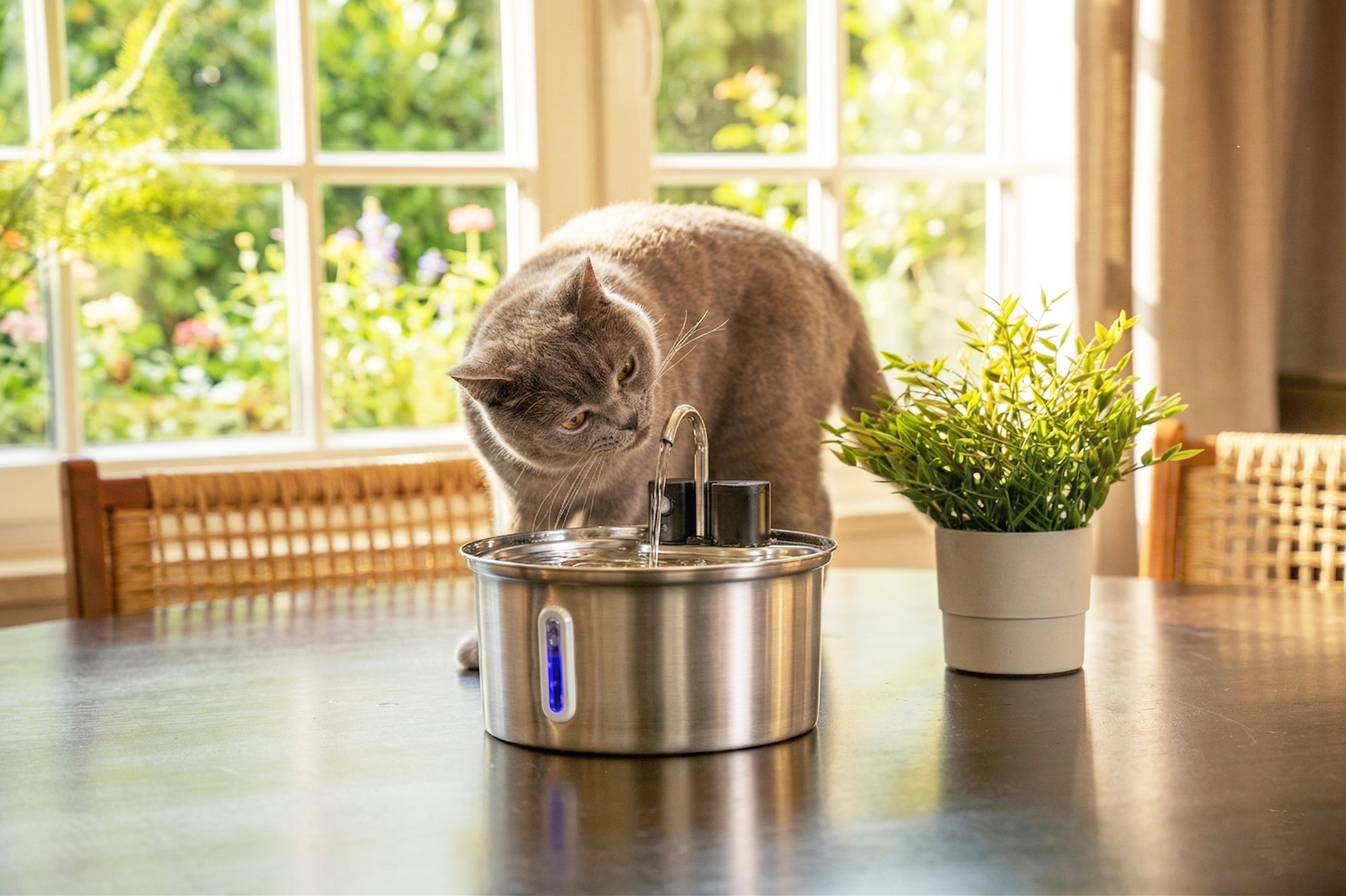
This balance avoids clinical coldness while keeping the brand clean and premium.

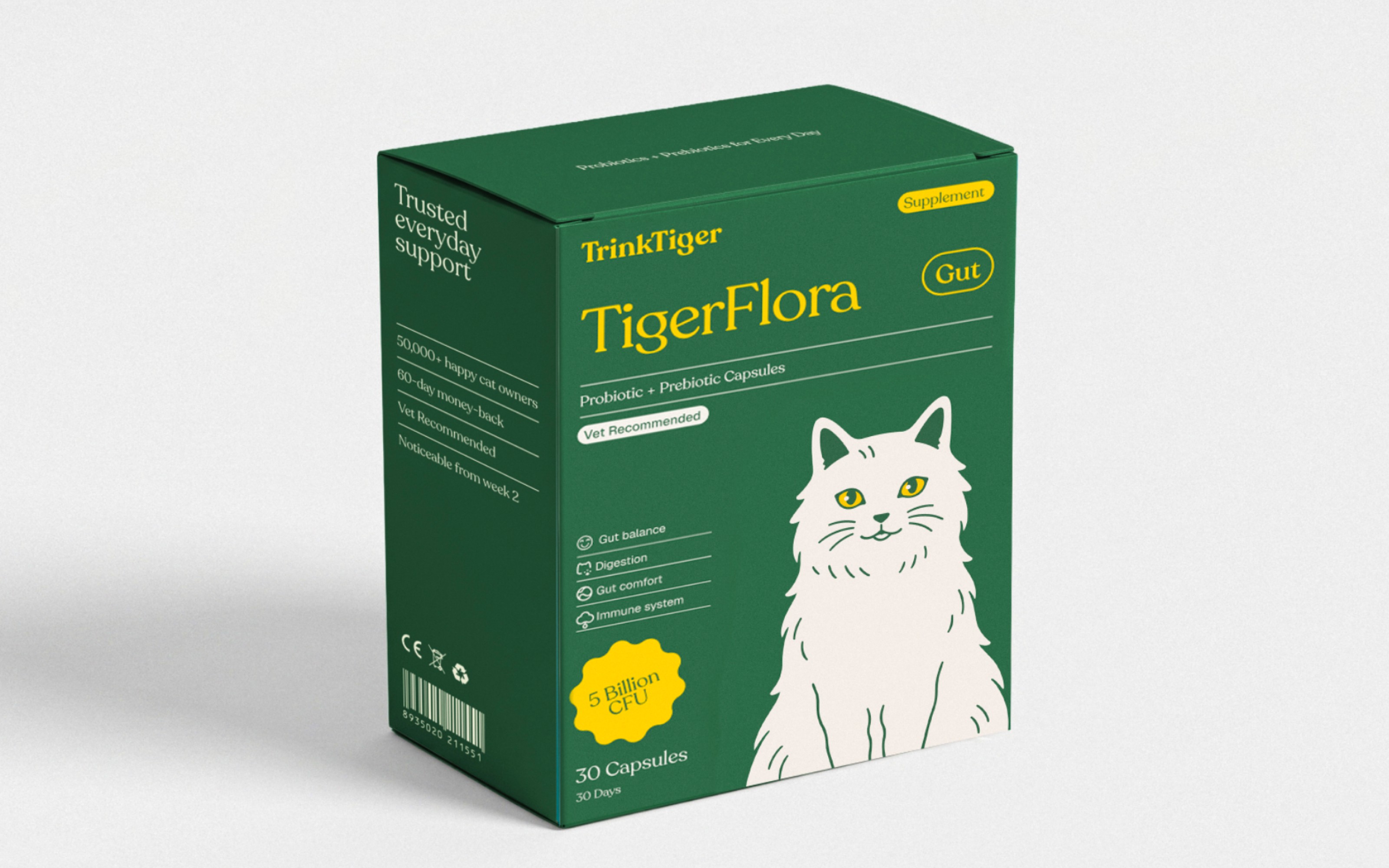
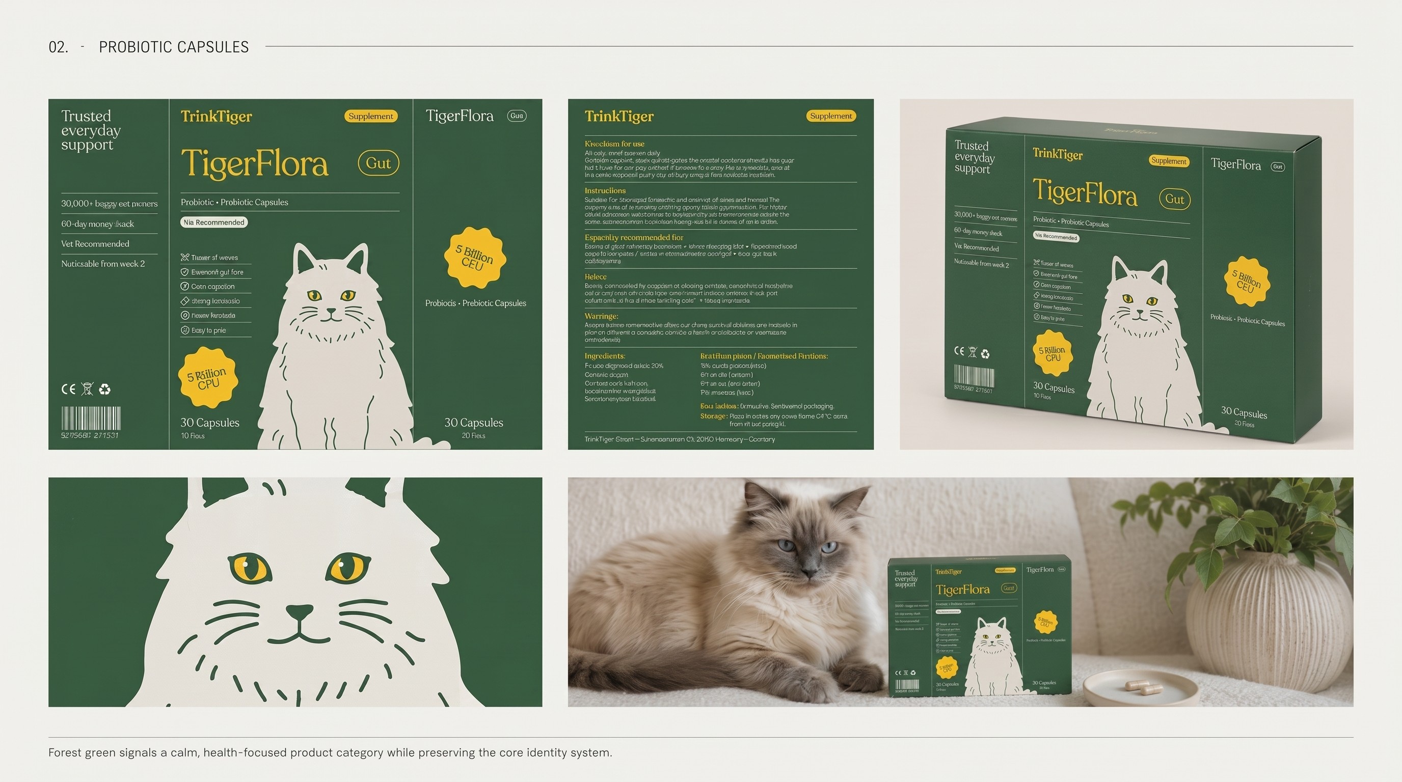
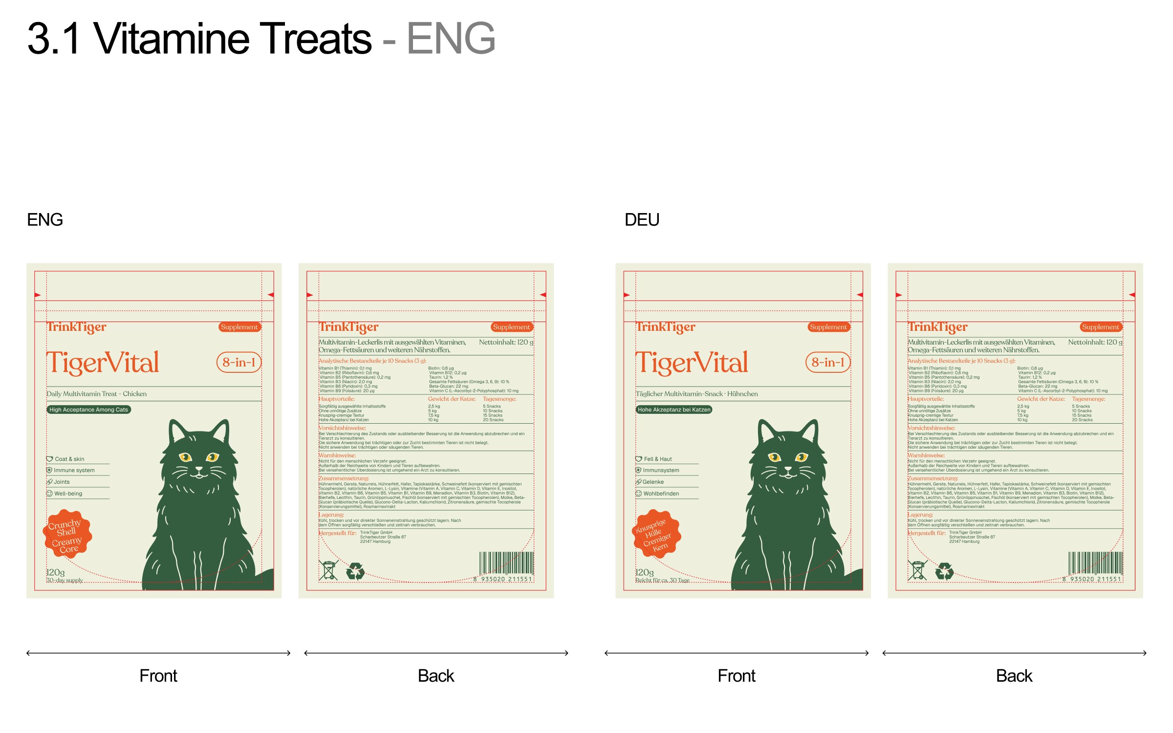
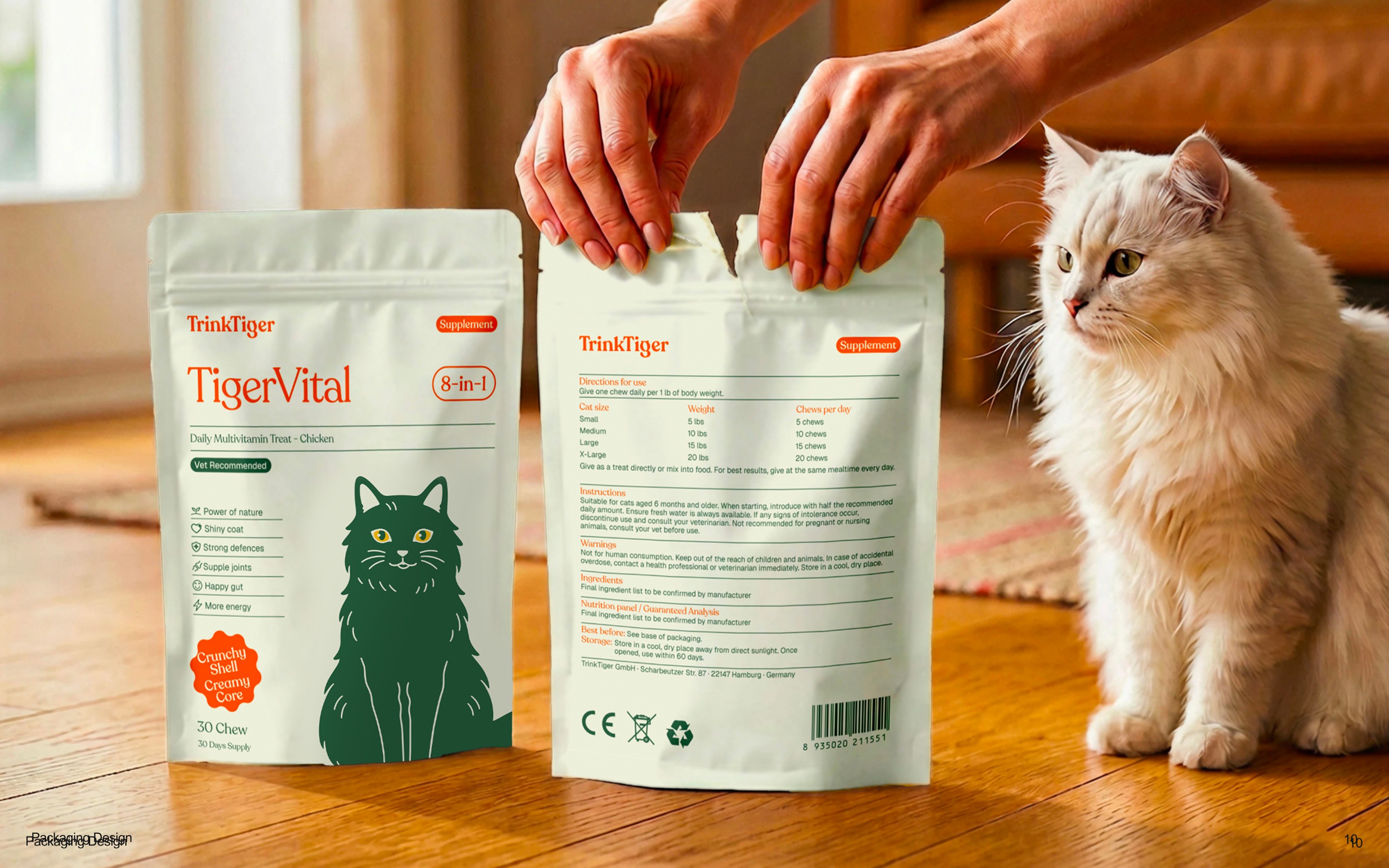
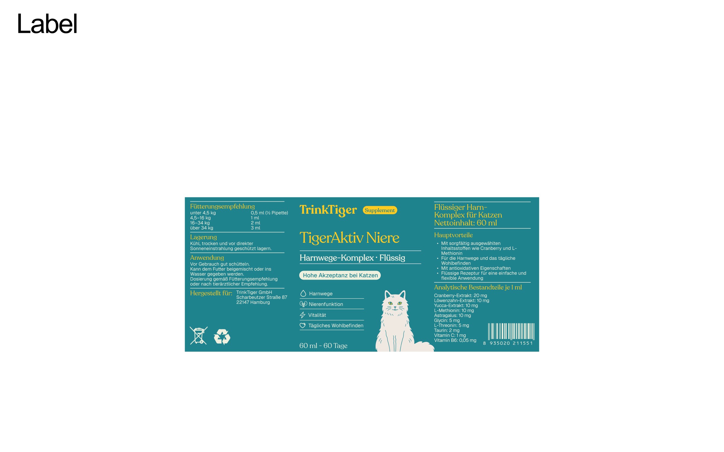
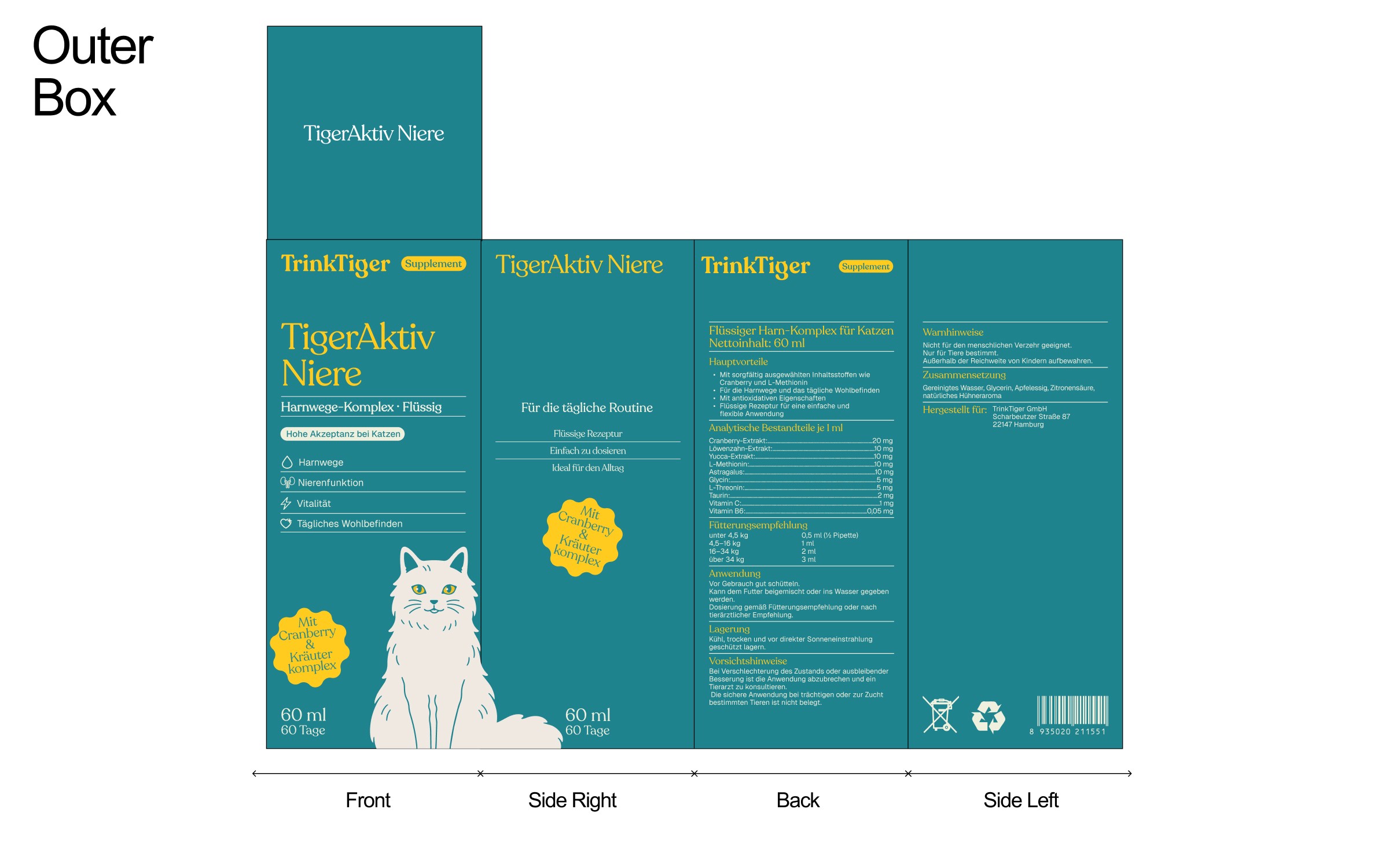
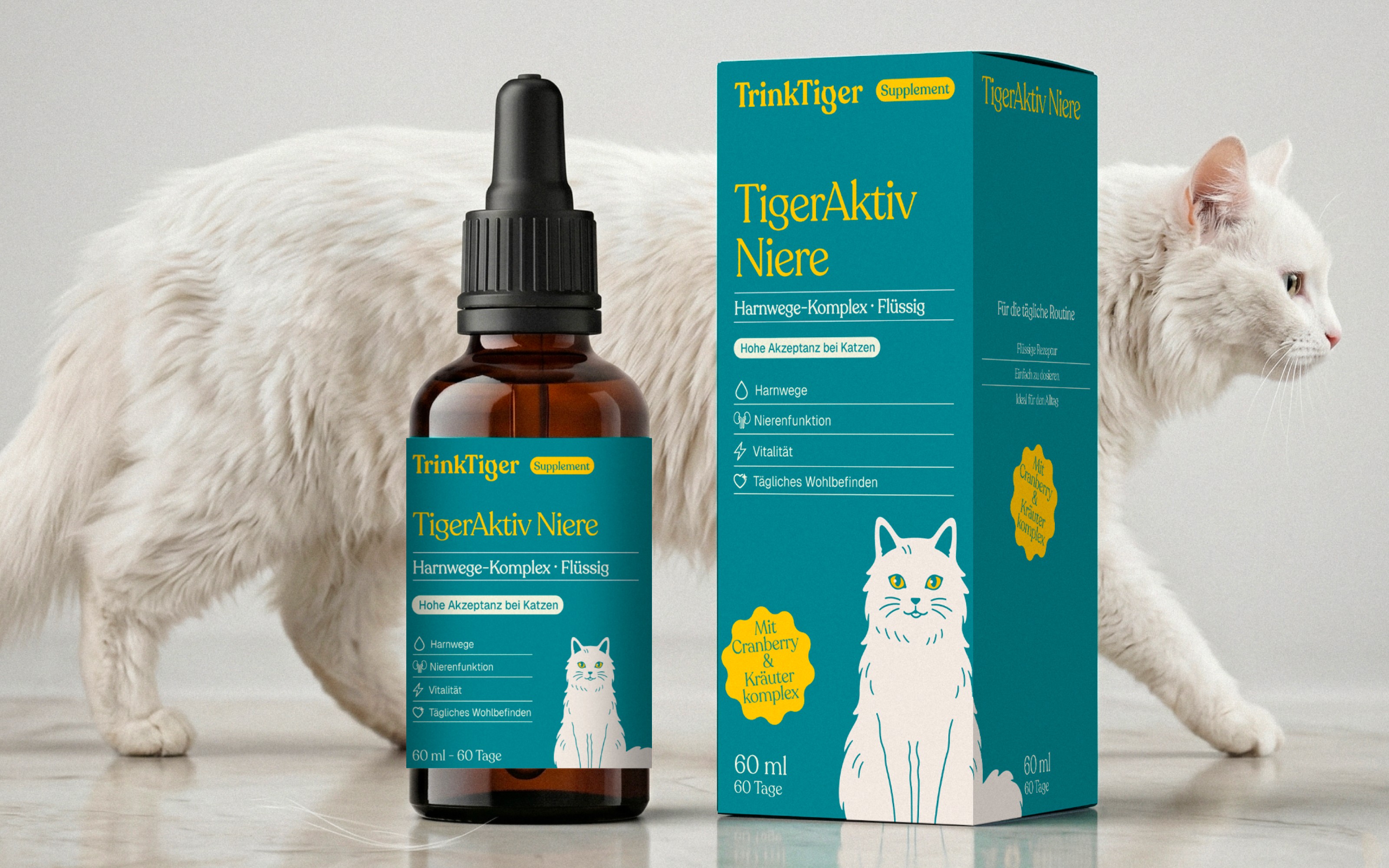
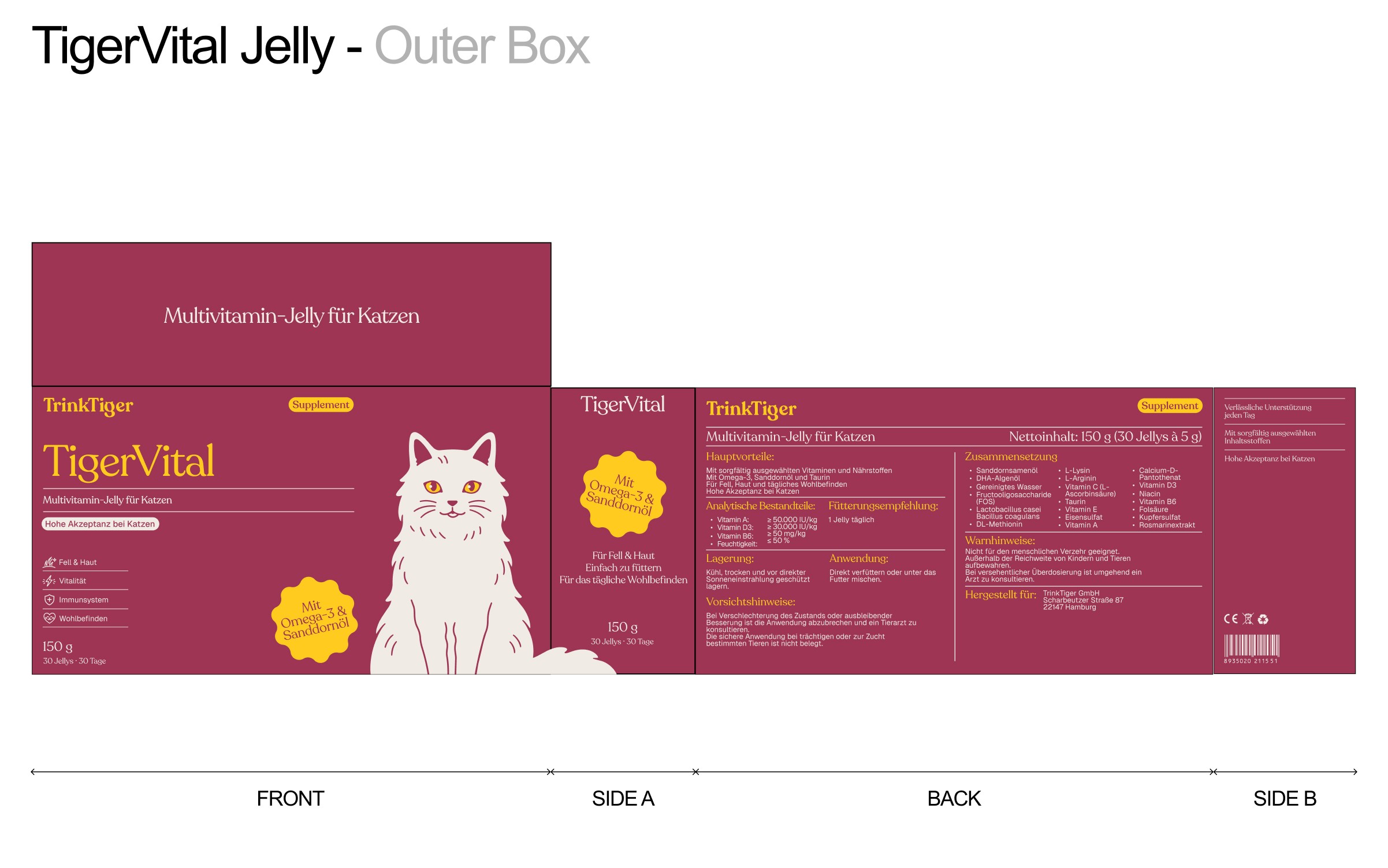
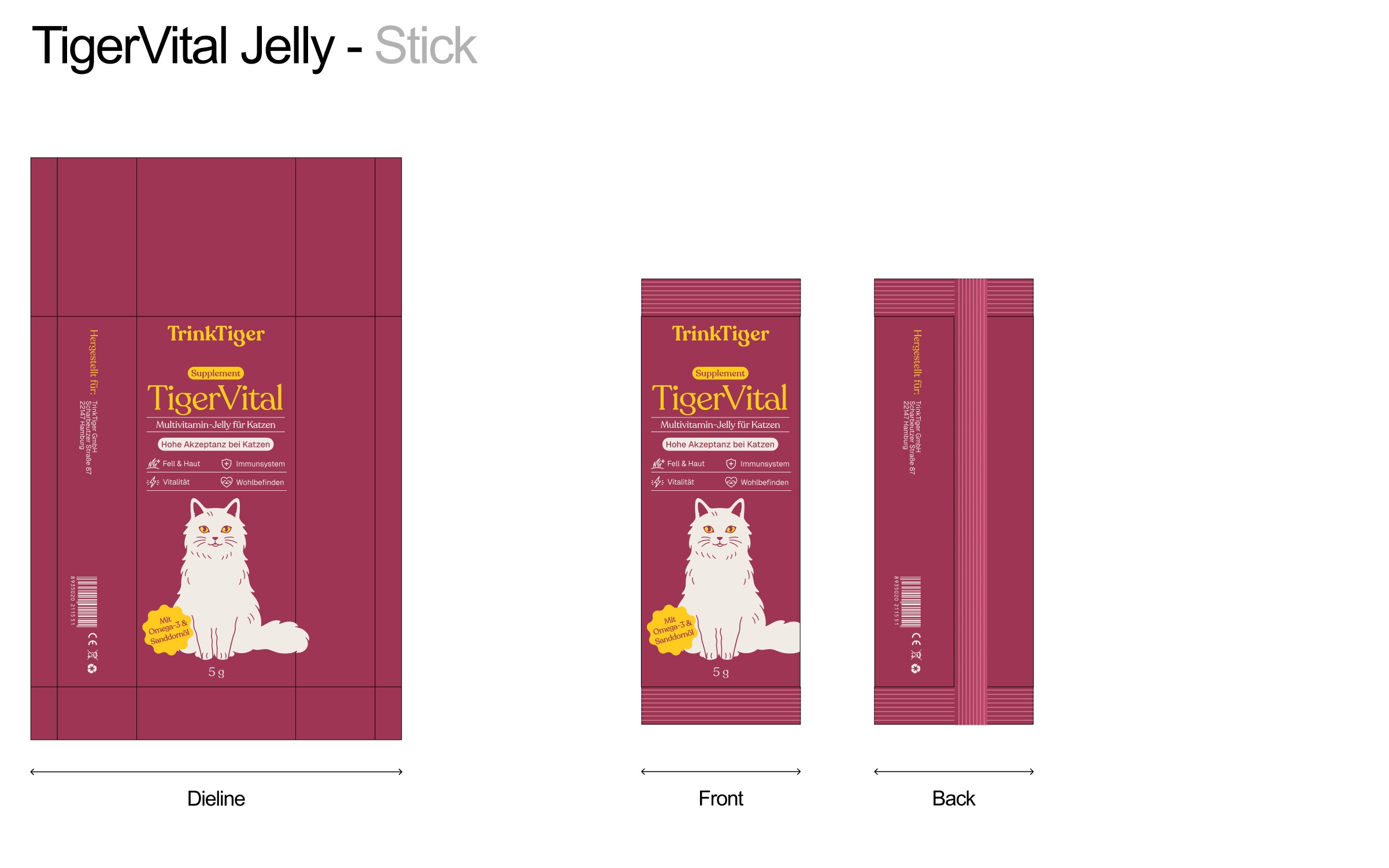
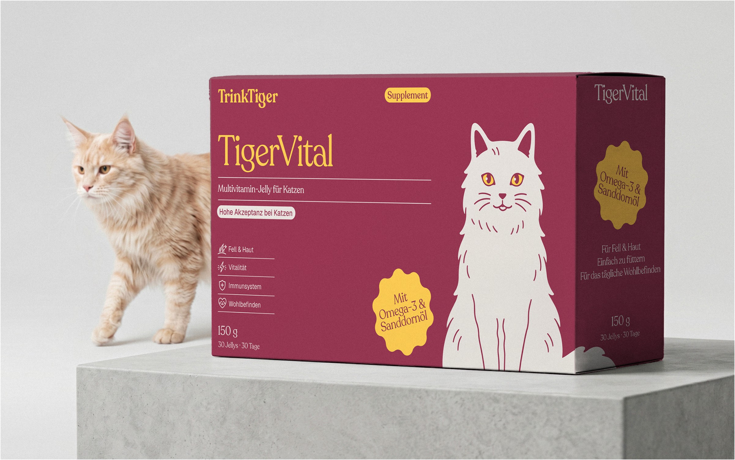
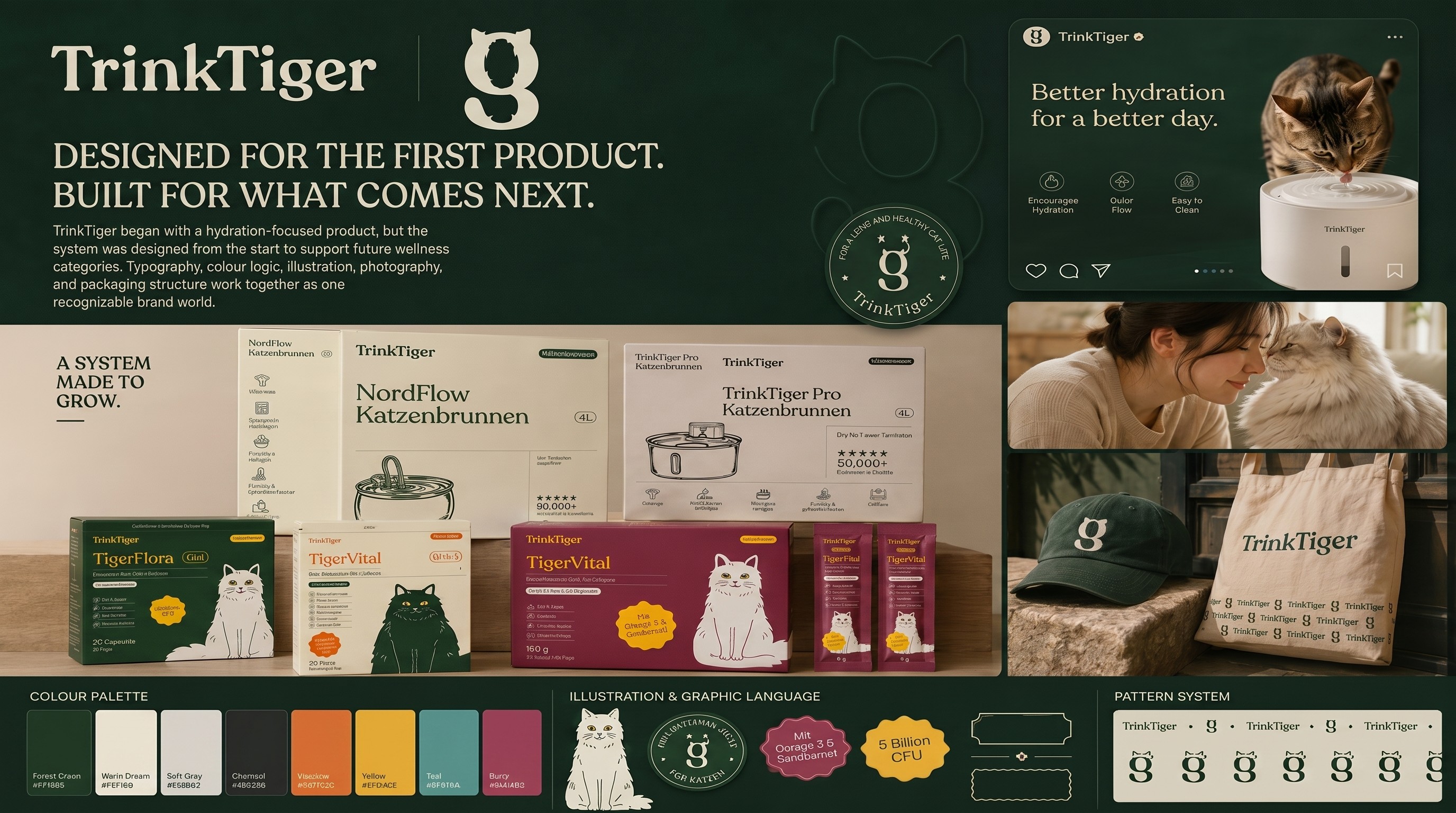
Packaging and supplement examples demonstrate how typography, colour, and iconography work together within the system.






Scalability & Future Growth
The TrinkTiger identity is built as a modular system. Typography, colour, iconography and photography can flex as new products and categories are introduced without losing the core visual language.
Clear Product Hierarchy
The system creates a repeatable structure for:
brand
product name
key product information

This gives new products a consistent starting point without making every application look identical.
Flexible Packaging Logic
Packaging is treated as a connected family rather than a collection of isolated designs.
Shared typography, colour roles and graphic cues create continuity, while individual products still have room to establish their own identity within the range.
Consistent Visual Language
The same core cues repeat across the system:
serif-led typography
a restrained colour palette
simple icons and illustration
The aim is recognition without forcing every application into exactly the same composition.

This gives new products a consistent starting point without making every application look identical.
Flexible Packaging Logic
Packaging is treated as a connected family rather than a collection of isolated designs.
Shared typography, colour roles and graphic cues create continuity, while individual products still have room to establish their own identity within the range.
Consistent Visual Language
The same core cues repeat across the system:
serif-led typography
a restrained colour palette
simple icons and illustration
The aim is recognition without forcing every application into exactly the same composition.

READY TO BUILD A BRAND SYSTEM THAT CAN GROW WITH THE BUSINESS?
Brand consistency gets harder as products, packaging and digital touchpoints multiply.
A useful identity should do more than look distinctive. It should give the team clear rules for how the brand appears, communicates and expands.
UXphoria develops brand systems that connect positioning, identity and real-world applications, giving growing consumer brands a clearer foundation to build from.