


Jibi
UI Designer
Table of Contents:
Project Overview
Ginju came to UXphoria with an existing packaging direction and a new wellness brand to launch on Shopify.
Starting from that packaging foundation, UXphoria developed the broader brand system, CRO strategy, content architecture, UX/UI and Shopify implementation for the complete ecommerce launch.
The challenge was not simply to place four wellness shots online. Ginju needed a clear system to show where shoppers should start, how the products differ, how they fit into a weekly routine, and when recurring purchase makes more sense than a one-off box.
Platform: Shopify | New ecommerce launch
Services: CRO strategy, ecommerce strategy, brand development, content strategy and copywriting, information architecture, UX/UI, responsive design, Shopify development and launch
Industry: Wellness / DTC

Building the buying system before designing the storefront
With four products, a flat product grid would have asked first-time shoppers to interpret the range without enough guidance.
Some products were intended to form the core routine. Others worked better as additions. The subscription model also needed to feel central to the business without forcing new visitors into a recurring commitment before they understood the products.
UXphoria structured the ecommerce experience around three questions:
Where should someone start?
Which product fits what they are looking for?
How can a first purchase develop into a repeatable weekly ritual?
These questions shaped the collection logic, content hierarchy, subscription architecture and visual interface.

Instead of treating all four products as equal catalogue items, UXphoria structured the range around a core weekly ritual, optional additions and need-based entry paths.
From existing packaging to a broader brand system
Rather than creating Ginju’s identity from scratch, UXphoria used the existing packaging as the starting point and expanded it into a broader brand and digital system designed to work across ecommerce touchpoints.
The expanded identity introduced:
NIVEAU typography
a high-contrast black and white foundation
Heliconia orange and Exquisite Gold
an organic illustration language
bold product and lifestyle imagery
a visual system that could extend across brand, content and commerce
The more important challenge was making that identity work commercially.

A Shopify experience needs to accommodate product education, pricing, subscription plans, reassurance, product choices and repeated purchase actions. The brand could not disappear as the amount of information increased.
UXphoria therefore treated brand and ecommerce as one connected system. Typography, photography, illustration, color and interface hierarchy all had to remain recognisably Ginju while supporting increasingly complex purchase decisions.
Four products, but not four equal decisions
One of UXphoria’s core CRO decisions was to avoid presenting Ginju’s four shots as four equal product choices.
Instead, the collection establishes Ginger Lemon and Turmeric Recovery as The Daily Rituals, with the direction to start there every week.
Cherry and Matcha appear separately as products shoppers can add when they want something different.
Core weekly ritual
Ginger Lemon
Turmeric Recovery
Optional additions
Cherry
Matcha
This creates a more deliberate product hierarchy.
First-time shoppers receive a clearer starting point, while returning customers have room to expand or personalise the routine.
Rather than making every product compete equally for attention, the merchandising system gives each product a clearer role.
Letting shoppers explore by intent, not only by product name
Product names alone are not always enough to help someone choose.
Ginju’s collection therefore introduces another discovery layer through “What are you reaching for?”, organising the range around routes such as:
Morning + Energy
Recovery + Training
Focus + Calm
Further down, “Not sure where to start?” turns those broader routes into more explicit starting scenarios.

UXphoria introduced these paths so shoppers could enter the range by intent as well as by product name, making the collection work as a decision system rather than a flat inventory grid.
Someone who already knows the products can browse the individual shots.
Someone new can begin with the core ritual.
Someone thinking about a particular moment or need can enter through the most relevant route.
The ecommerce architecture therefore does more than display products. It translates the range into clearer decisions.
Making the weekly box the core offer
Ginju’s commercial model was built around consistency, so recurring purchase could not feel like a secondary subscription widget added at the end of the page.
The weekly box needed a defined role inside the product architecture.
Ginju’s default recurring offer is an eight-shot weekly box containing:
four Ginger Lemon shots
four Turmeric Recovery shots
Instead of asking new customers to construct a subscription from scratch, the experience provides a recognisable default based on the two Daily Ritual products.

Individual shots remain available.
Cherry and Matcha can expand the ritual.
But the weekly box becomes the clearest expression of how Ginju expects the core products to work together.
That same idea is reinforced throughout the homepage, so the subscription model feels like part of the brand and product story rather than an ecommerce feature disconnected from it.
Designing subscription around different levels of commitment
Recurring purchase was important to the business, but a new customer still needed an easier way into the product system.
The homepage introduces three recurring plan levels:
Just Me
Two of Us
The Family
At the same time, it preserves a separate “Just want to try first?” path for a one-off box.
This creates two clear purchase routes.
Ready for the weekly ritual
Choose the recurring plan that fits the household.
Still deciding
Try one box without an ongoing commitment.

The goal was not to hide the one-off option so subscription would win by force.
UXphoria designed the plan structure to make the recurring model understandable while keeping a lower-commitment first-purchase route visible.
The plan selector, content hierarchy and offer framing were therefore designed as part of the purchase decision itself.
Content strategy as part of the conversion architecture
Ginju operates in an explanation-heavy product category.
Shoppers may have questions about ingredients, product differences, production, routines, subscription frequency and how different products fit into different moments.
UXphoria wrote the ecommerce copy and distributed product education across the shopping journey rather than isolating all information inside one educational block.

For Ginju, that meant placing:
product-specific explanations close to the products
routine and use-context content around product discovery
subscription information close to commitment decisions
process and sourcing information where reassurance becomes important
offer details close to plan selection and purchase actions
The homepage moves between product explanation, plan selection, routine framing, production information and purchase actions instead of separating “education” from “shopping.”
The aim was not to add more content by default.
It was to answer the right questions in the right sequence.
Building production and purchase reassurance into the experience
For Ginju, product confidence also depended on tangible production and delivery details.
The experience surfaces information around:
cold pressing
glass packaging
organic certification
freshness
weekly delivery
subscription flexibility
cancellation access

These details are positioned inside the buying experience rather than left only in policy pages or the footer.
They help shoppers understand how the product is made, how the weekly model works, and what they are committing to before they purchase.
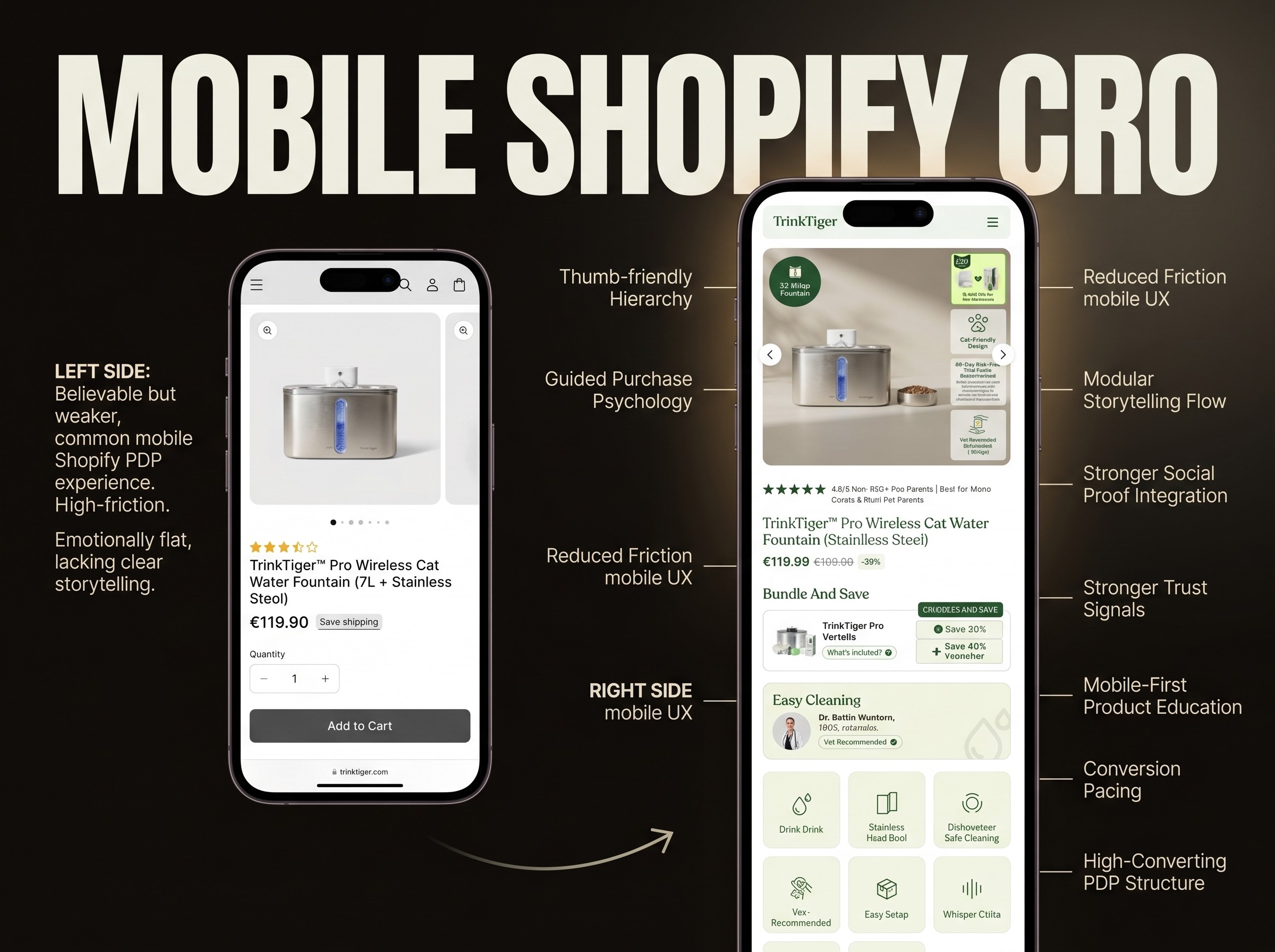
Carrying the same decisions onto mobile
The mobile experience was designed as part of the same ecommerce system, not as a reduced desktop afterthought.
On a smaller screen, the same questions still had to remain understandable:
What should I start with?
Which product fits what I am looking for?
What am I subscribing to?
Which plan have I selected?
Can I try it without subscribing?
What information do I need before continuing?
The mobile layouts therefore had to compress product storytelling, plan selection, education and action without losing Ginju’s expressive visual identity.
Rather than copying the desktop layout one-to-one, UXphoria adapted the hierarchy so the same buying logic could remain clear on a narrower screen.
Product cards, educational sections, plan choices and purchase actions were reorganised around mobile scanning and interaction.

From strategy to Shopify launch
Ginju was a completely new ecommerce launch, which allowed UXphoria to connect strategy and implementation from the beginning.
UXphoria led the project across:
CRO and ecommerce strategy
product and subscription architecture
information architecture
brand development
content strategy and copywriting
UX/UI design
responsive and mobile design
Shopify development
launch implementation

Because UXphoria also handled Shopify implementation, the same strategic decisions carried through to launch.
The Daily Rituals hierarchy, optional add-on logic, plan structure, content hierarchy, brand system and mobile layouts were implemented as one connected ecommerce system rather than split across unrelated teams.
Development was therefore part of delivering the commercial and design strategy, not simply a separate handoff after the interface had been approved.
The resulting experience
Ginju was a completely new ecommerce launch, which allowed UXphoria to connect strategy and implementation from the beginning.
UXphoria led the project across:
CRO and ecommerce strategy
product and subscription architecture
information architecture
brand development
content strategy and copywriting
UX/UI design
responsive and mobile design
Shopify development
launch implementation
Because UXphoria also handled Shopify implementation, the same strategic decisions carried through to launch.

The Daily Rituals hierarchy, optional add-on logic, plan structure, content hierarchy, brand system and mobile layouts were implemented as one connected ecommerce system rather than split across unrelated teams.
Development was therefore part of delivering the commercial and design strategy, not simply a separate handoff after the interface had been approved.
Project scope
Strategy
CRO strategy
ecommerce strategy
product architecture
subscription architecture
product discovery strategy
information architecture
Brand development
expansion of the existing packaging direction
broader brand identity
typography
color system
illustration direction
digital art direction
ecommerce brand application
Content
content strategy
ecommerce copywriting
product education structure
routine and use-context messaging
subscription and offer messaging
purchase-path content hierarchy
UX/UI
Shopify ecommerce UX
homepage design
collection and product-discovery experience
subscription and plan-selection UX
responsive design
mobile ecommerce UX
ecommerce visual system
Development
Shopify development
responsive implementation
ecommerce component implementation
content implementation
launch execution
A Shopify experience designed around the decision, not just the interface
Ginju shows how UXphoria approaches a new ecommerce launch.
First define the product system, the choices shoppers need to make and the commercial model. Then design and build the Shopify experience around those decisions.
For Ginju, that meant turning four products into a clearer weekly ritual, making subscription easier to understand, and carrying an existing packaging direction into a complete digital brand and ecommerce system.
Planning a Shopify launch or redesign where product discovery, subscription choices or education are becoming difficult to structure?
See how similar improvements can be applied to your store